sample(x = 1:10, size = 1)[1] 6Some of the calculations in our discussion of regression (Section 5.3), like the standard error and the \(p\)-value, depended on some quirky statistical logic: If we could repeat our statistical procedure over and over on new samples, what would the distribution of results look like?
Our main goal in this unit is to accomplish two things.
Make these statistical calculations a little bit less weird, by actually going through the “draw new samples over and over” process ourselves. In other words, we will run simulations to get an idea of how these statistical calculations work.
Harness the true power of computer programming. Computers are really, really good at doing the same thing over and over. We will use the for loop in R to execute the same code very many times.
R has built-in random number generators, which let you draw random numbers from a specified distribution. There are tons available, but we will use just a few in this course:
sample(), to randomly sample values from a particular vector.
runif(), to randomly draw numbers from a uniform distribution — every value between two points is equally likely.
rnorm(), to randomly draw numbers from a normal distribution — the familiar bell curve.
If we want to tell R “randomly pick a number from 1 to 10”, we can use the sample() function.
sample(x = 1:10, size = 1)[1] 6The x argument gives the function the set of values to choose from, and the size argument tells it how many to choose. When your size is greater than 1, you may also want to set replace = TRUE to allow for sampling with replacement, where the same value can be chosen more than once. (The default is to sample without replacement.)
sample(x = 1:10, size = 5) # no repeats possible[1] 8 2 3 5 4sample(x = 1:10, size = 5, replace = TRUE) # repeats possible[1] 9 4 4 5 2sample(x = c("bear", "moose", "pizza"), size = 2) # sampling non-numeric values[1] "pizza" "moose"Every time you use a random number function like sample(), you will get different results. That can be annoying when you’re writing a Quarto document — every time you render it, the numbers change! To prevent this, you can set a random seed with the set.seed() function.
set.seed(14)
sample(x = 1:10, size = 5, replace = TRUE)
[1] 9 9 4 4 10# Will get same results after setting same seed
set.seed(14)
sample(x = 1:10, size = 5, replace = TRUE)[1] 9 9 4 4 10You can put any whole number into the set.seed() function. I often use the jersey numbers of athletes I like and the years of memorable historical events.
Another useful function is runif(), which samples from the uniform distribution between two points. Use the min and max arguments to specify these points.
runif(n = 5) # between 0 and 1 by default[1] 0.1637900 0.4741345 0.8512112 0.8574638 0.7396847runif(n = 5, min = 10, max = 100)[1] 41.77897 70.60358 86.64114 63.58222 41.58333Use runif() when you want a flat histogram.
library("tidyverse")
library("cowplot")
theme_set(
  theme_cowplot()
)

tibble(fake_x = runif(10000, min = 0, max = 100)) |>
  ggplot(aes(x = fake_x)) +
  geom_histogram(binwidth = 5)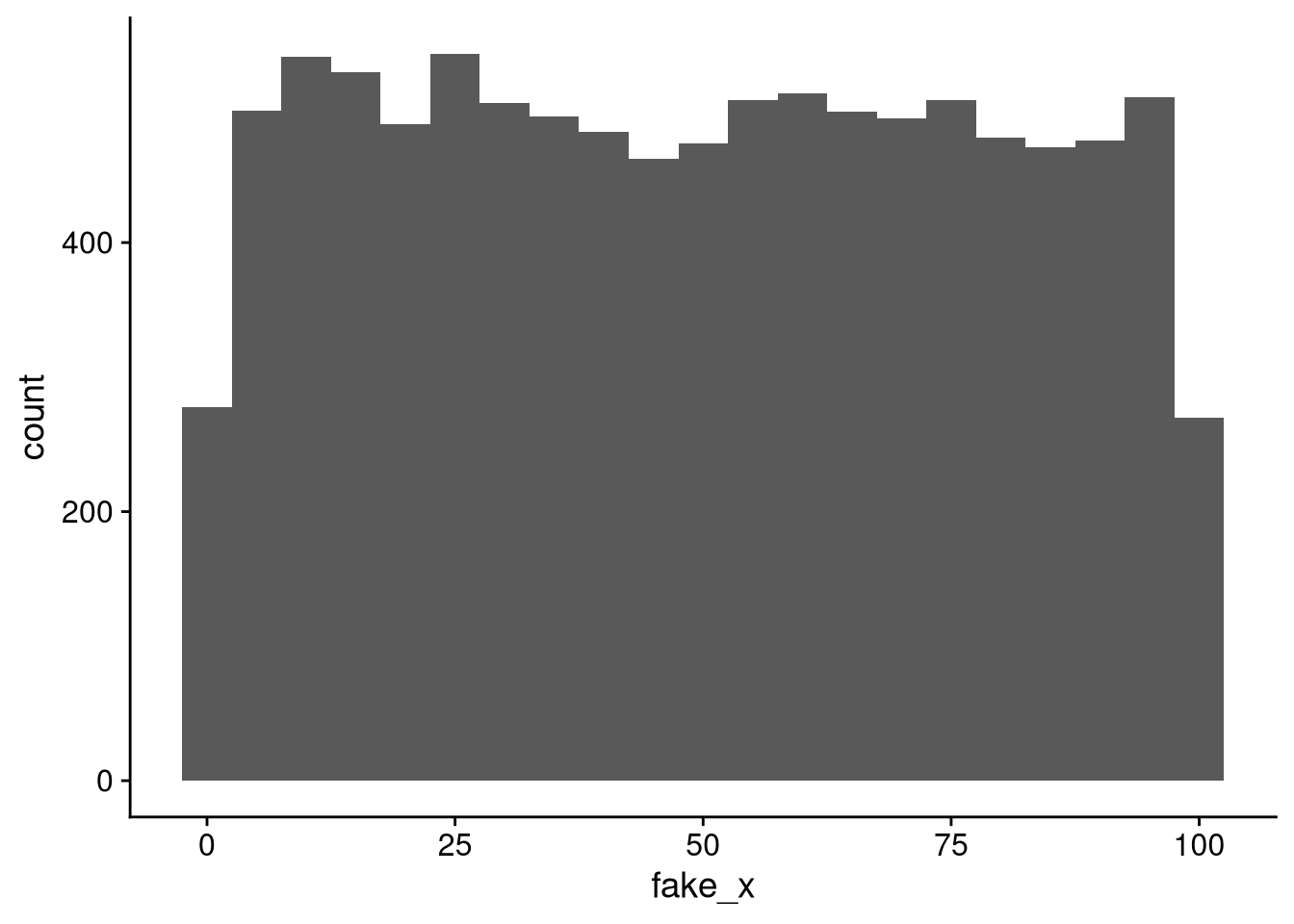
The last random number generator we’ll look at is rnorm(), which samples from the normal distribution. The normal distribution is a bell-curve-shaped probability distribution. Use the mean and sd arguments to specify the mean and standard deviation.
rnorm(n = 5) # mean 0, sd 1 by default[1] -0.5305785 0.1476253 0.4697936 0.4822537 -1.4676395rnorm(n = 5, mean = 100, sd = 10)[1] 96.95443 106.14779 107.88788 100.81268 94.27664The histogram of normally distributed values has the familiar bell curve shape.
df_fake_normal <- tibble(fake_x = rnorm(10000, mean = 50, sd = 20))

df_fake_normal |>
  ggplot(aes(x = fake_x)) +
  geom_histogram(binwidth = 5)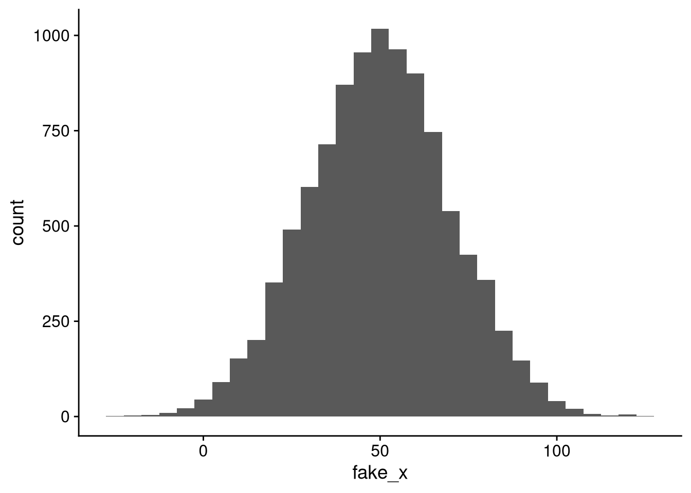
The heuristic I mentioned in Section 3.3.1, that 95% of the data falls within 2 standard deviations of the mean, is exact in the case of a normal distribution.
df_fake_normal |>
  mutate(within2 = if_else(fake_x >= 10 & fake_x <= 90, "within", "outside")) |>
  count(within2) |>
  mutate(prop = n / sum(n))
# A tibble: 2 × 3
within2 n prop
<chr> <int> <dbl>
1 outside 487 0.0487
2 within 9513 0.951 It can often be useful to simulate data using random number generators. That might seem weird, since our ultimate goal is to learn about the real world, and numbers that we make up on our computer aren’t from the real world. But there are a couple of ways a simulation can help us:
The weirdness of simulations hasn’t stopped certain political scientists from trying to use ChatGPT responses in place of real survey data! See my Political Analysis article with fellow Vanderbilt professors Jim Bisbee, Josh Clinton, Cassy Dorff, and Jenn Larson.
Giving us a benchmark to test against. If we know exactly what patterns our analysis should find — which we do if we control exactly how the data was generated — then we can use a simulation to gauge how far off our statistical models might be in practice.
What we’ll be doing today — helping us wrap our heads around difficult statistical concepts. Concepts like the standard error and \(p\)-value are about what would happen if you took lots of samples from a population with certain properties. It can be weird to think about those with real data, since we typically only have one sample to work with. Simulations make it much easier to think through.
Let’s simulate data that follows a linear regression model: \[y \approx 10 + 0.5 x.\] To make it a bit more fun than just calling the variables “x” and “y” — with no effect on the simulation results, as this is fake data — let’s assume the feature represents someone’s feeling thermometer score toward Chancellor Diermeier, and the response is their feeling toward Elon Musk. We’ll set it up so that we have a residual standard deviation of 5.
set.seed(1873)  # crescere aude!
df_simulation <- tibble(
  x_diermeier = runif(
    n = 50,
    min = 20,
    max = 80
  ),
  y_musk = 10 + 0.5 * x_diermeier + rnorm(n = 50, mean = 0, sd = 5)
)

# Scatterplot
df_simulation |>
  ggplot(aes(x = x_diermeier, y = y_musk)) +
  geom_point() +
  geom_smooth(method = "lm")
`geom_smooth()` using formula = 'y ~ x'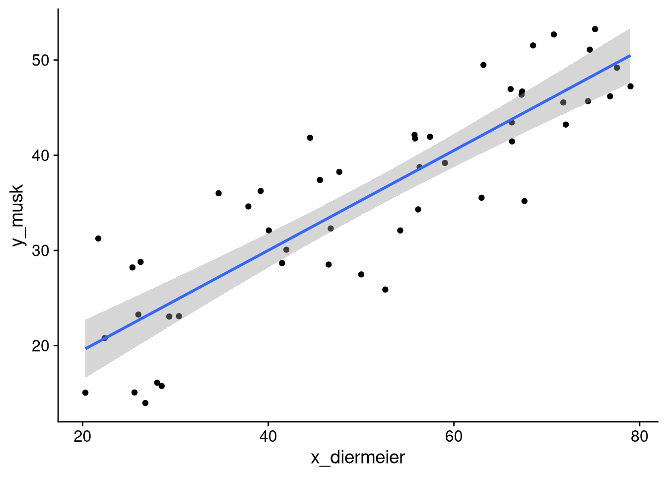
# Regression results
fit_musk_diermeier <- lm(y_musk ~ x_diermeier, data = df_simulation)

summary(fit_musk_diermeier)
Call:
lm(formula = y_musk ~ x_diermeier, data = df_simulation)

Residuals:
     Min       1Q   Median       3Q      Max
-10.7309  -3.5182  -0.4258   4.1335  10.8545

Coefficients:
            Estimate Std. Error t value Pr(>|t|)
(Intercept)  9.01924    2.30978   3.905 0.000294 ***
x_diermeier  0.52482    0.04285  12.249  < 2e-16 ***
---
Signif. codes:  0 '***' 0.001 '**' 0.01 '*' 0.05 '.' 0.1 ' ' 1

Residual standard error: 5.437 on 48 degrees of freedom
Multiple R-squared:  0.7576,    Adjusted R-squared:  0.7526
F-statistic:   150 on 1 and 48 DF,  p-value: < 2.2e-16
The “true” intercept and slope are 10 and 0.5, respectively. We estimate an intercept and slope of roughly 9.0 and 0.52, each within a standard error of the true value. The \(p\)-value also tells us that it would be very unlikely to get such a steep slope from a sample of this size if the slope in the population were 0.
You might remember that the standard error has a kind of weird definition. The sampling distribution of a statistic (e.g., a regression coefficient) is the distribution of values it would take across every possible sample from the population. The standard error is the standard deviation of that distribution. Usually we can’t directly observe sampling distributions because we only have one sample. However, when we are running a simulation where we generate the data, we can generate as many samples as we want to!
Now we can’t take every possible sample from the distribution we used to generate our data, as there are infinitely many. But we can take a lot of samples, in order to closely approximate the sampling distribution. We then run into another problem — isn’t this going to be really tedious? If we want to run a hundred simulations, do we have to repeat our code hundreds of times?
df_simulation_1 <- tibble(
  x_diermeier = runif(n = 50,
                      min = 20,
                      max = 80),
  y_musk = 10 + 0.5 * x_diermeier + rnorm(n = 50, mean = 0, sd = 5)
)
fit_1 <- lm(y_musk ~ x_diermeier, data = df_simulation_1)

df_simulation_2 <- tibble(
  x_diermeier = runif(n = 50,
                      min = 20,
                      max = 80),
  y_musk = 10 + 0.5 * x_diermeier + rnorm(n = 50, mean = 0, sd = 5)
)
fit_2 <- lm(y_musk ~ x_diermeier, data = df_simulation_2)

# ... and so on?It turns out we don’t have to write the same code hundreds of times. R, like virtually every programming language, has a feature called a for loop that lets us repeatedly run code with the same structure.
A for loop in R has the following syntax:
for (i in values) {
  ## code goes here
}values: The values to iterate over. Whatever the length of values is, that’s the number of times the loop will run. So if you put 1:10 here, it will run ten times. If you put c("bear", "moose", "pizza"), it will run three times.
i: A variable name that is assigned to the corresponding element of values each time the loop runs. You can use any valid variable name in place of i here, though i is what you’ll see most commonly.
Inside the brackets: Code that is run every time the loop is executed.
Before getting into a more complicated situation, let’s look at a couple of simple examples of for loops. Here’s one where we repeat the following process ten times: Sample five random numbers from a normal distribution with mean 100 and standard deviation 10, and calculate their mean.
set.seed(97)
for (i in 1:10) {
  x <- rnorm(5, mean = 100, sd = 10)
  print(mean(x))
}
[1] 105.1824
[1] 97.267
[1] 98.56986
[1] 101.0031
[1] 95.62228
[1] 108.3287
[1] 98.22445
[1] 96.06675
[1] 103.3609
[1] 95.77259When we do it that way, the results just disappear into the ether. If you want to save the results to work with later (e.g., to plot them), you need to write the loop to save them.
Nerd note: In the code here, I just set up a null variable to hold the results, and then in each iteration of the loop I append the current iteration’s results to that variable. If you’re ever doing high-end computational work in R, this way will run more slowly than if you set up the full vector to store the results first. For example, in this case I could have done sim_results <- rep(NA, 10) before the loop, and then did sim_results[i] <- mean(x) inside the loop. For our purposes in this class I’m going to stick with the easier way, but you should be aware in case you ever find yourself doing more advanced computational work.
set.seed(97)
sim_results <- NULL  # variable that will hold the results
for (i in 1:10) {
  x <- rnorm(5, mean = 100, sd = 10)
  sim_results <- c(sim_results, mean(x))
}

sim_results
[1] 105.18240 97.26700 98.56986 101.00311 95.62228 108.32866
[7] 98.22445 96.06675 103.36093 95.77259Now let’s use a loop to look at the sampling distribution of the regression coefficients when we simulate data according to our regression formula. We will repeat the following process 100 times:
Simulate a dataset according to our formula.
Run a regression on the simulated data.
Extract the coefficient and standard error estimates, storing them as a data frame.
Our goal is to see how much our estimates of the slope and intercept vary from sample to sample.
library("broom")

# Set random seed as described above
set.seed(1618)

# Empty data frame to store results
df_regression_sim <- NULL

for (i in 1:100) {
  # Simulate data
  df_loop <- tibble(
    x_diermeier = runif(n = 50, min = 20, max = 80),
    y_musk = 10 + 0.5 * x_diermeier + rnorm(n = 50, mean = 0, sd = 5)
  )

  # Run regression
  fit_loop <- lm(y_musk ~ x_diermeier, data = df_loop)

  # Store results of this iteration
  df_regression_sim <- bind_rows(df_regression_sim, tidy(fit_loop))
}

df_regression_sim
# A tibble: 200 × 5
term estimate std.error statistic p.value
<chr> <dbl> <dbl> <dbl> <dbl>
1 (Intercept) 7.87 2.85 2.76 8.19e- 3
2 x_diermeier 0.513 0.0590 8.70 2.00e-11
3 (Intercept) 9.81 2.00 4.91 1.08e- 5
4 x_diermeier 0.503 0.0394 12.8 4.98e-17
5 (Intercept) 8.92 2.48 3.59 7.69e- 4
6 x_diermeier 0.496 0.0469 10.6 3.82e-14
7 (Intercept) 6.32 2.22 2.85 6.45e- 3
8 x_diermeier 0.573 0.0424 13.5 5.68e-18
9 (Intercept) 8.80 2.37 3.71 5.36e- 4
10 x_diermeier 0.507 0.0439 11.6 1.83e-15
# ℹ 190 more rowsdf_regression_sim contains the output from our simulation. It has 200 rows — two per simulation iteration, one for the intercept and one for the slope. You can see just from glancing at the results that there’s some variation from simulated sample to simulated sample, but the intercepts are fairly close to the true value of 10 and the slopes are very close to the true value of 0.5.
Remember from above that the standard error is the standard deviation of the sampling distribution. So to get an idea of how much the intercept and slope vary from sample to sample, we will calculate the standard deviation of the 100 draws we took from the sampling distribution. The number that R spits out as the “standard error” with regression results (the "std.error" column of tidy() output) is actually an estimate of the true standard error. We’ll also take the average of these standard error estimates to see how they compare to the true variability of the coefficients from sample to sample.
df_regression_sim |>
  group_by(term) |>
  summarize(
    avg_est = mean(estimate),
    true_se = sd(estimate),
    avg_se_est = mean(std.error)
  )
# A tibble: 2 × 4
term avg_est true_se avg_se_est
<chr> <dbl> <dbl> <dbl>
1 (Intercept) 10.1 2.21 2.24
2 x_diermeier 0.498 0.0417 0.0422Here’s what this table is telling us:
Across our 100 simulations, the average intercept is very close to its true value of 10, and the average slope is very close to its true value of 0.5. This is an illustration of the fact that linear regression is unbiased in statistical terms.
The true standard error of the intercept is about 2.2, so across samples we would expect to estimate an intercept within \(10 \pm 4.4\) about 95% of the time. The true standard error of the slope is about 0.04, so across samples we would expect to estimate a slope within \(0.5 \pm 0.08\) about 95% of the time.
On average, R’s estimate of the standard error of both coefficients comes pretty close to the true standard error. The upshot is that these values are pretty reliable for statistical inference — any given sample will give us a good idea as to the range of plausible values for the intercept and slope.
To illustrate that final point, there’s another question we can use our simulation results to answer. Let’s use the formula \[\text{estimate} \pm 2 \times \text{std error}\] to determine a range of plausible values for the coefficient. If we do this with each of the samples in our simulation, how often does the range of plausible values include the true value of 0.5?
df_regression_sim |>
  filter(term == "x_diermeier") |>
  arrange(estimate) |>
  mutate(
    id = row_number(),
    lower = estimate - 2 * std.error,
    upper = estimate + 2 * std.error,
    type = if_else(
      lower <= 0.5 & upper >= 0.5,
      "includes true slope",
      "doesn't include true slope"
    )
  ) |>
  ggplot(aes(xmin = lower, xmax = upper, y = id)) +
  geom_linerange(aes(color = type)) +
  geom_vline(xintercept = 0.5, linetype = "dashed")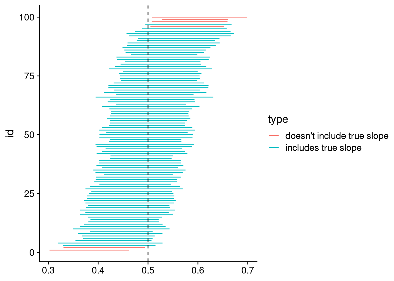
The range includes the true slope in 94 out of our 100 samples. That’s very close to the 95% we would expect from a confidence interval calculation like this one.
Run a new simulation with a similar regression equation, except where the true slope is 0. This time do 1000 simulation iterations instead of 100. In how many of your iterations is the slope “statistically significant”, in terms of having a \(p\)-value of 0.05 or less?
#
# [Write your answer here]
#The basic idea behind these simulations can also be applied to estimate uncertainty in real data problems. To see this principle in action, we will work with the same survey data as in Chapter 5.
df_anes <- read_csv("https://bkenkel.com/qps1/data/anes_2020.csv")

df_anes
# A tibble: 8,280 × 31
id state female lgbt race age education employed hours_worked
<dbl> <chr> <dbl> <dbl> <chr> <dbl> <chr> <dbl> <dbl>
1 1 Oklah… 0 0 Hisp… 46 Bachelor… 1 40
2 2 Idaho 1 0 Asian 37 Some col… 1 40
3 3 Virgi… 1 0 White 40 High sch… 0 0
4 4 Calif… 0 0 Asian 41 Some col… 1 40
5 5 Color… 0 0 Nati… 72 Graduate… 0 0
6 6 Texas 1 0 White 71 Some col… 0 0
7 7 Wisco… 1 0 White 37 Some col… 1 30
8 8 <NA> 1 0 White 45 High sch… 0 40
9 9 Arizo… 1 0 White 70 High sch… 0 0
10 10 Calif… 0 0 Hisp… 43 Some col… 1 30
# ℹ 8,270 more rows
# ℹ 22 more variables: watch_tucker <dbl>, watch_maddow <dbl>,
# therm_biden <dbl>, therm_trump <dbl>, therm_harris <dbl>,
# therm_pence <dbl>, therm_obama <dbl>, therm_dem_party <dbl>,
# therm_rep_party <dbl>, therm_feminists <dbl>, therm_liberals <dbl>,
# therm_labor_unions <dbl>, therm_big_business <dbl>,
# therm_conservatives <dbl>, therm_supreme_court <dbl>, …We want to separate the signal from the noise — to figure out what inferences we can reliably draw from the data we have, as opposed to patterns that might have shown up through sheer random chance. Our goal is to gauge “If we could draw a bunch of new random samples of the same size, how much would we expect our regression estimates to vary from sample to sample?” This may seem like an impossible question to answer with a single sample. It turns out, however, that we can get an approximate answer using a technique called the bootstrap.
The basic idea behind the bootstrap is that we can generate new random samples by sampling with replacement from our original data. Because we are sampling with replacement, some of our original observations will show up 2, 3, or even more times in any given bootstrap sample, while others won’t be included at all. In the same fashion as the simulations we ran above, we won’t just draw one bootstrap sample — we will draw hundreds or even thousands of new samples, so as to get an idea of how our statistical calculations would vary from sample to sample.
To draw a single bootstrap sample from a data frame, we can use the slice_sample() function.
set.seed(1789)

df_boot <- df_anes |>
  slice_sample(prop = 1, replace = TRUE)

df_boot
# A tibble: 8,280 × 31
id state female lgbt race age education employed hours_worked
<dbl> <chr> <dbl> <dbl> <chr> <dbl> <chr> <dbl> <dbl>
1 3243 Calif… 1 0 Nati… 64 Some col… 0 0
2 7413 Michi… 1 0 White 70 Bachelor… 0 0
3 3511 Washi… 0 0 White 76 Bachelor… 0 0
4 4841 Massa… 1 0 White 80 <NA> 0 0
5 6165 Washi… 1 0 White 64 Bachelor… 1 40
6 2698 Maryl… 1 0 White 47 Graduate… 1 50
7 5578 Calif… 0 0 Asian 55 Bachelor… 1 60
8 3543 Nevada 1 0 Black 52 Some col… 1 40
9 7316 Calif… 1 0 White 80 Less tha… 0 0
10 3827 Flori… 0 NA Nati… NA Some col… 0 0
# ℹ 8,270 more rows
# ℹ 22 more variables: watch_tucker <dbl>, watch_maddow <dbl>,
# therm_biden <dbl>, therm_trump <dbl>, therm_harris <dbl>,
# therm_pence <dbl>, therm_obama <dbl>, therm_dem_party <dbl>,
# therm_rep_party <dbl>, therm_feminists <dbl>, therm_liberals <dbl>,
# therm_labor_unions <dbl>, therm_big_business <dbl>,
# therm_conservatives <dbl>, therm_supreme_court <dbl>, …The prop = 1 argument tells slice_sample() to draw the same number of observations as in the original sample. (If we wanted half as many, for example, we would use prop = 0.5.) The replace = TRUE argument tells it to sample with replacement. Without this argument, we would just end up with our original data but with the rows in a different order, giving us exactly the same statistical calculations as we got originally.
If we look at the relationship between feelings toward the police and feelings toward Donald Trump, we see similar — but not exactly the same — estimates in the original sample and in our singular (so far) bootstrap resample.
fit_main <- lm(therm_trump ~ therm_police, data = df_anes)
fit_boot <- lm(therm_trump ~ therm_police, data = df_boot)

summary(fit_main)
Call:
lm(formula = therm_trump ~ therm_police, data = df_anes)

Residuals:
    Min      1Q  Median      3Q     Max
-61.972 -32.068  -1.972  34.242 112.789

Coefficients:
             Estimate Std. Error t value Pr(>|t|)
(Intercept)  -12.7889     1.2503  -10.23   <2e-16 ***
therm_police   0.7476     0.0167   44.78   <2e-16 ***
---
Signif. codes:  0 '***' 0.001 '**' 0.01 '*' 0.05 '.' 0.1 ' ' 1

Residual standard error: 35.69 on 7188 degrees of freedom
  (1090 observations deleted due to missingness)
Multiple R-squared:  0.2181,    Adjusted R-squared:  0.218
F-statistic: 2005 on 1 and 7188 DF, p-value: < 2.2e-16summary(fit_boot)
Call:
lm(formula = therm_trump ~ therm_police, data = df_boot)

Residuals:
    Min      1Q  Median      3Q     Max
-62.277 -31.733  -1.461  34.177 114.083

Coefficients:
             Estimate Std. Error t value Pr(>|t|)
(Intercept)  -14.0829     1.2558  -11.21   <2e-16 ***
therm_police   0.7636     0.0168   45.47   <2e-16 ***
---
Signif. codes:  0 '***' 0.001 '**' 0.01 '*' 0.05 '.' 0.1 ' ' 1

Residual standard error: 35.59 on 7168 degrees of freedom
  (1110 observations deleted due to missingness)
Multiple R-squared:  0.2238,    Adjusted R-squared:  0.2237
F-statistic:  2067 on 1 and 7168 DF,  p-value: < 2.2e-16
A single bootstrap sample doesn’t give us very much that’s interesting. The method requires that we resample from the data many times, then look at the distribution of the results. We can accomplish that with (hopefully you guessed it…) a for loop.
# Set random seed as discussed above
set.seed(1066)

# Empty data frame to store resampling results
df_coef_boot <- NULL

# Resample the data 1000 times (aka: 1000 bootstrap iterations)
for (i in 1:1000) {
  # Draw bootstrap sample
  df_boot <- slice_sample(df_anes, prop = 1, replace = TRUE)

  # Rerun regression model on bootstrap sample
  fit_boot <- lm(therm_trump ~ therm_police, data = df_boot)

  # Save results
  df_coef_boot <- bind_rows(df_coef_boot, tidy(fit_boot))
}

df_coef_boot
# A tibble: 2,000 × 5
term estimate std.error statistic p.value
<chr> <dbl> <dbl> <dbl> <dbl>
1 (Intercept) -10.7 1.25 -8.57 1.27e-17
2 therm_police 0.722 0.0167 43.2 0
3 (Intercept) -11.3 1.21 -9.30 1.79e-20
4 therm_police 0.732 0.0163 45.0 0
5 (Intercept) -13.2 1.27 -10.4 3.79e-25
6 therm_police 0.752 0.0170 44.3 0
7 (Intercept) -14.0 1.30 -10.8 7.64e-27
8 therm_police 0.758 0.0173 43.9 0
9 (Intercept) -10.2 1.22 -8.36 7.58e-17
10 therm_police 0.711 0.0164 43.4 0
# ℹ 1,990 more rowsUsing the results of the bootstrap resampling, we can directly look at the distribution of regression coefficients across samples.
df_coef_boot |>
  ggplot(aes(x = estimate)) +
  geom_histogram() +
  facet_wrap(~ term, ncol = 2, scales = "free_x") +
  panel_border()
`stat_bin()` using `bins = 30`. Pick better value with `binwidth`.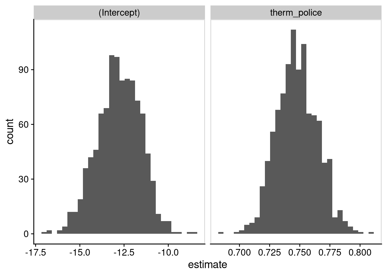
You might notice that both distributions have a bell curve shape. This isn’t a coincidence. It’s an example of the central limit theorem, an important result showing that many common statistics have approximately normal sampling distributions. You’ll also notice that both distributions are centered roughly around the coefficients from the regression with the original data. The estimated intercept tends to be between -15 and -10, while the estimated slope tends to be between 0.72 and 0.78.
We can gauge the standard error by taking the standard deviation of the bootstrap distribution, and we can also calculate a range of plausible values by using the percentiles.
df_coef_boot |>
  group_by(term) |>
  summarize(
    std_err = sd(estimate),
    lower = quantile(estimate, 0.025),
    upper = quantile(estimate, 0.975)
  )
# A tibble: 2 × 4
term std_err lower upper
<chr> <dbl> <dbl> <dbl>
1 (Intercept) 1.22 -15.2 -10.5
2 therm_police 0.0170 0.717 0.782These are pretty close to the standard error from the original analysis, as well as the range of coefficients we would estimate with the “\(\pm\) 2 standard errors” rule.
tidy(fit_main) |>
  select(term, estimate, std.error) |>
  mutate(
    lower = estimate - 2 * std.error,
    upper = estimate + 2 * std.error
  )
# A tibble: 2 × 5
term estimate std.error lower upper
<chr> <dbl> <dbl> <dbl> <dbl>
1 (Intercept) -12.8 1.25 -15.3 -10.3
2 therm_police 0.748 0.0167 0.714 0.781What’s the point of bootstrapping if it ultimately yields close to the same answers as what we would get from the summary() output?
The bootstrap is more robust. In data situations with small samples, big outliers, or other issues, the bootstrap may be more reliable at estimating the amount of sample-to-sample variation in the regression coefficients than the standard formulas are.
The bootstrap is very widely applicable to statistical measures. For some calculations, there’s not a standard error calculation reported by default like there is for regression coefficients. But you can still bootstrap them: just resample from your original data with replacement, calculate the statistic on each bootstrap iteration, and then look at the distribution of bootstrap estimates to gauge the amount of variability and the plausible range of estimates.
By using the bootstrap and recovering close to the original results, you (I hope!) get a better idea of how it is that we can estimate sample-to-sample variability in a statistic even though we only actually observe a single sample of data.
Suppose the statistic you are interested in is the median of respondents’ feeling thermometer score toward Donald Trump. Use the bootstrap to estimate the standard error of the median, as well as a range of plausible medians.
#
# [Write your answer here]
#Suppose we want to predict someone’s feeling toward Donald Trump if all we know about them is that their feeling toward the police is a 50 on a 100-point scale. We know that we can use the regression formula, \[\text{response} \approx \text{intercept} + \text{slope} \times 50,\] to come up with a prediction. What’s harder is to gauge the amount of uncertainty in that prediction — i.e., to nail down the range of estimates that are plausible based on the knowledge we have. In part that’s because there are two sources of uncertainty.
The regression line doesn’t perfectly fit the data. There’s some spread between the points and the line, summarized by what R calls the residual standard error.
The regression line we estimate from our sample might be different than the line we would fit if we had the full population of data. In other words, there’s statistical uncertainty about the values of the slope and the intercept.
The bootstrap method lets us account for both of these sources of uncertainty. To accomplish this, we will use a simulation-within-a-simulation. For each bootstrap sample, we will:
Run the regression of Trump feeling on police feeling.
Use the intercept and slope to calculate predicted Trump feeling for someone whose police feeling is 50.
Use the predicted value and the residual standard error to simulate a distribution of potential values of Trump feeling.
# Set random seed as discussed above
set.seed(1985)

# Null variable to store simulation results
pred_at_50 <- NULL

# Simulating 1000 times
for (i in 1:1000) {
  # Draw bootstrap resample
  df_boot <- slice_sample(df_anes, prop = 1, replace = TRUE)

  # Fit regression model and extract coefficients + residual sd
  fit_boot <- lm(therm_trump ~ therm_police, data = df_boot)
  tidy_boot <- tidy(fit_boot)
  intercept <- tidy_boot$estimate[1]
  slope <- tidy_boot$estimate[2]
  sigma <- glance(fit_boot)$sigma

  # Calculate main prediction at therm_police = 50
  pred_boot <- intercept + slope * 50

  # Simulate distribution of predictions
  dist_pred_boot <- rnorm(100, mean = pred_boot, sd = sigma)

  # Append results to storage vector
  pred_at_50 <- c(pred_at_50, dist_pred_boot)
}
We can take a look at the distribution of predictions:
tibble(pred_at_50) |>
  ggplot(aes(x = pred_at_50)) +
  geom_histogram()
`stat_bin()` using `bins = 30`. Pick better value with `binwidth`.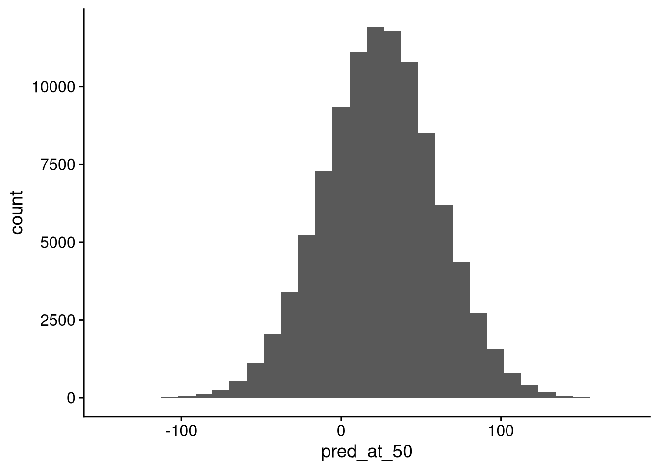
The main takeaway here is that there’s a ton of uncertainty in this prediction. A sizable percentage of the simulated predictions are below 0, and a few are even above 100. Let’s look at the average and standard deviation.
length(pred_at_50)[1] 100000mean(pred_at_50)[1] 24.33769sd(pred_at_50)[1] 35.74144The standard deviation here is not much larger than the residual standard deviation in our regression model on the original data. That tells me that the statistical uncertainty about the coefficient values is contributing relatively little to our uncertainty about the prediction. Instead, most of the variation in predictions is coming from the fact that the points are spread out pretty far from the regression line in the first place.
Repeat the simulation from this section, but for someone whose feeling toward the police is 75 rather than 50. What differences do you see in the central tendency and the spread of the distribution of resampled predictions?
#
# [Write your answer here]
#