5  Correlation and Regression

In the previous section on data visualization (Chapter 4), we started to think about how to analyze relationships between variables. Now we’re going to extend some of those intuitions into more formal statistical calculations.

5.1 Data: 2020 American National Election Study

To study correlation and regression, we’ll look at a selection of data from the 2020 American National Election Study. The data file is called anes_2020.csv and is hosted on my website at https://bkenkel.com/qps1/data/anes_2020.csv.

Each row in the dataset is a different American survey respondent who was randomly sampled for inclusion in the survey. The columns record a variety of demographic and political information about each respondent. There are many more variables available in the raw data — we are only scratching the surface here.

library("tidyverse")

df_anes <- read_csv("https://bkenkel.com/qps1/data/anes_2020.csv")

glimpse(df_anes)
Rows: 8,280
Columns: 31
$ id                   <dbl> 1, 2, 3, 4, 5, 6, 7, 8, 9, 10, 11, 12, 13…
$ state                <chr> "Oklahoma", "Idaho", "Virginia", "Califor…
$ female               <dbl> 0, 1, 1, 0, 0, 1, 1, 1, 1, 0, 1, 0, 1, 0,…
$ lgbt                 <dbl> 0, 0, 0, 0, 0, 0, 0, 0, 0, 0, 0, 0, 0, 0,…
$ race                 <chr> "Hispanic", "Asian", "White", "Asian", "N…
$ age                  <dbl> 46, 37, 40, 41, 72, 71, 37, 45, 70, 43, 3…
$ education            <chr> "Bachelor's degree", "Some college", "Hig…
$ employed             <dbl> 1, 1, 0, 1, 0, 0, 1, 0, 0, 1, 1, 1, 0, 0,…
$ hours_worked         <dbl> 40, 40, 0, 40, 0, 0, 30, 40, 0, 30, 25, 5…
$ watch_tucker         <dbl> 0, 0, 0, 0, 0, 0, 0, 0, 0, 0, 0, 0, 0, 0,…
$ watch_maddow         <dbl> 0, 0, 0, 0, 0, 0, 0, 0, 0, 0, 0, 0, 0, 0,…
$ therm_biden          <dbl> 0, 0, 65, 70, 15, 85, 50, 50, 85, 85, 100…
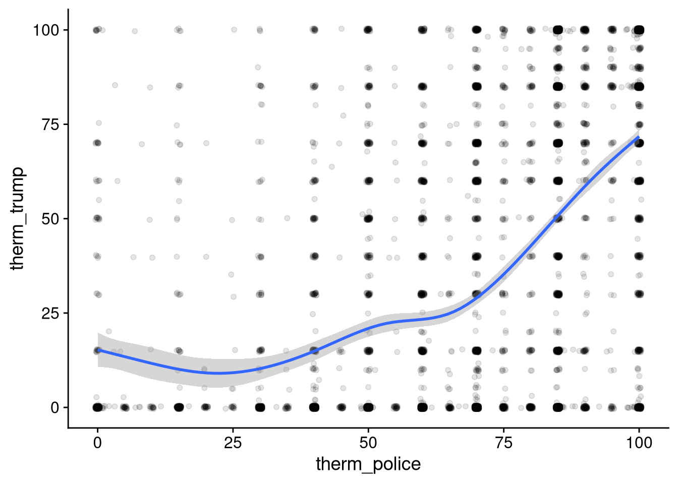
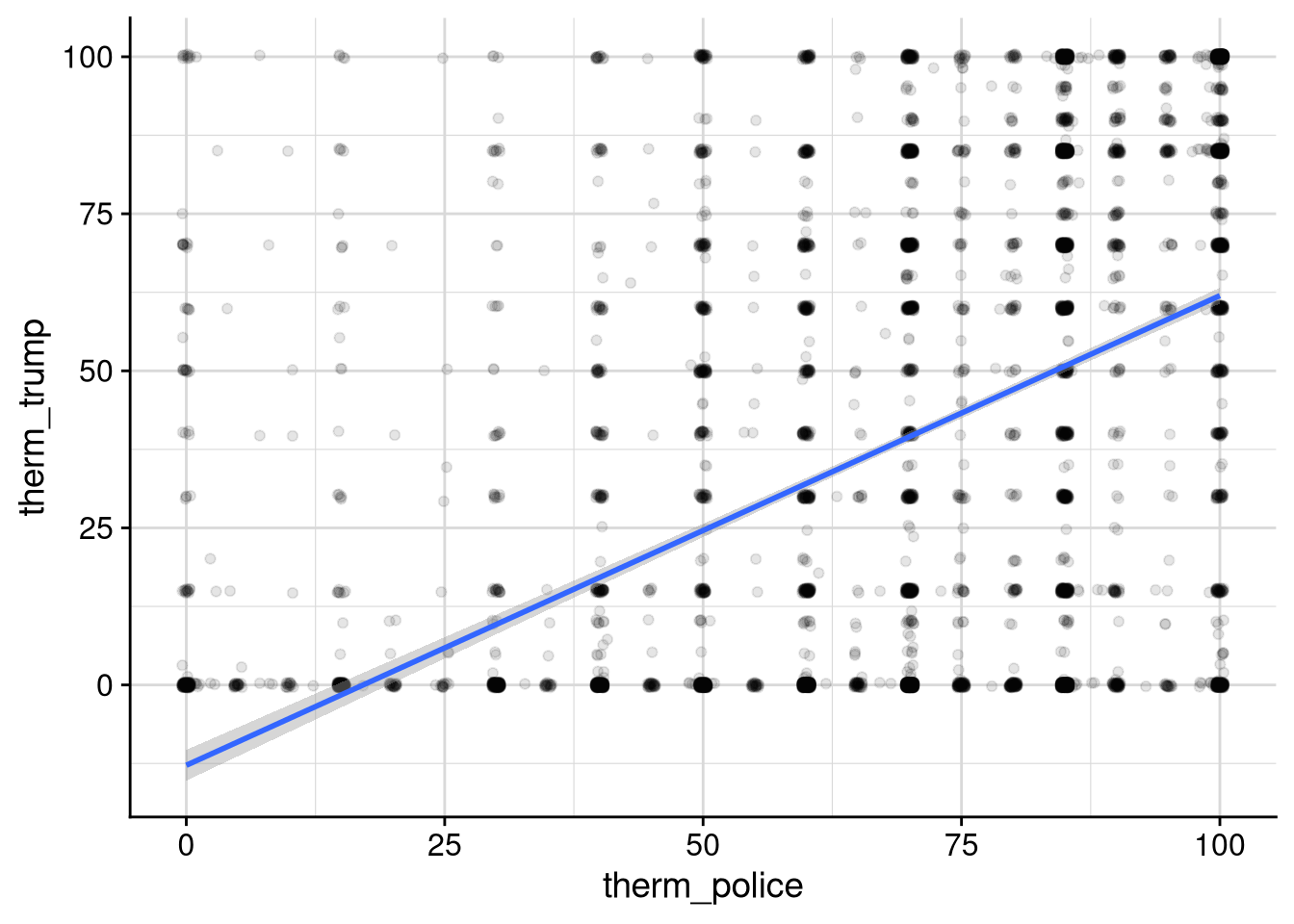
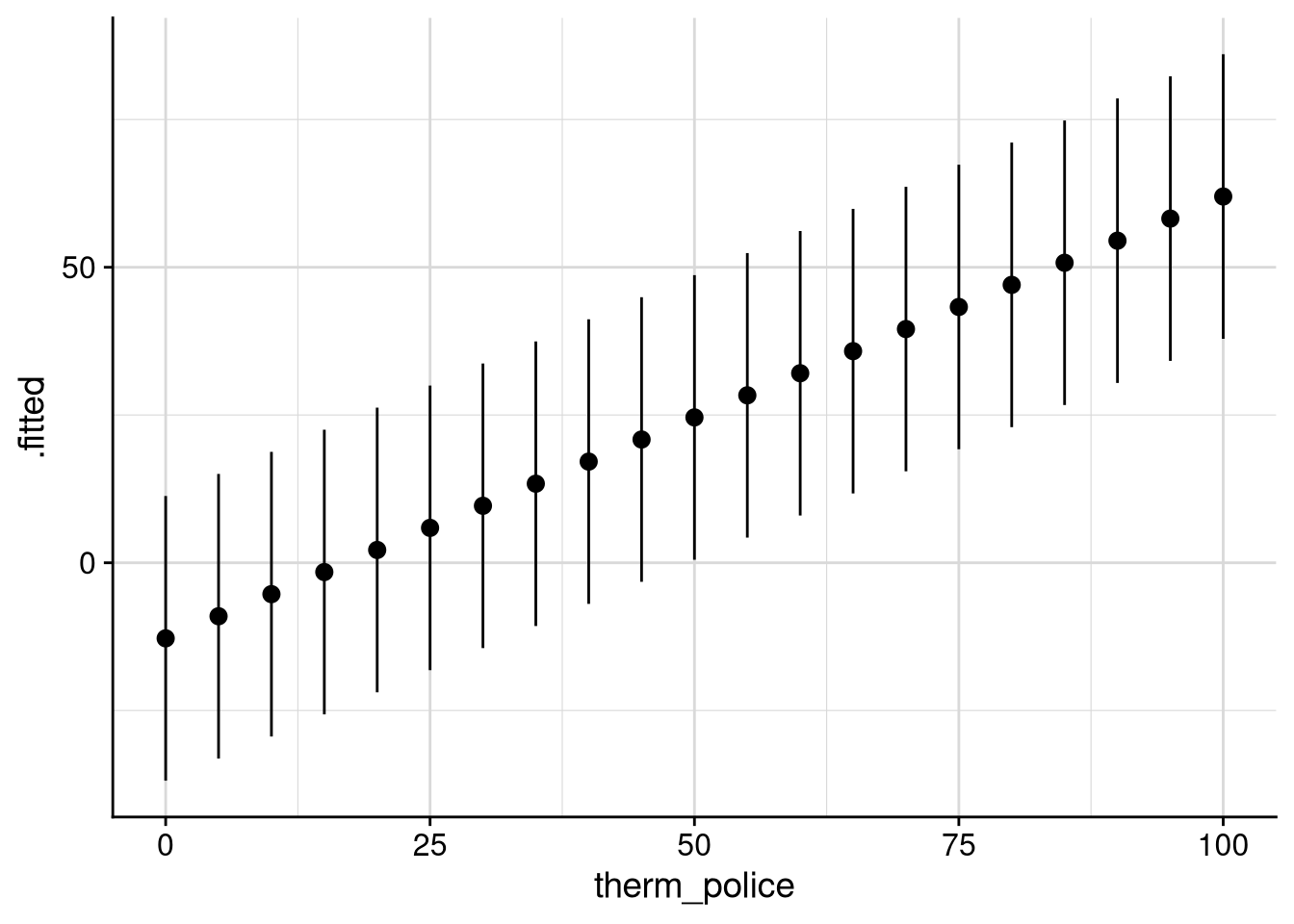
$ therm_trump          <dbl> 100, 0, 0, 15, 85, 0, 75, 100, 0, 0, 0, 0…
$ therm_harris         <dbl> 0, 0, 65, 85, 15, 85, 15, 50, 85, 50, 100…
$ therm_pence          <dbl> 85, 0, 0, 15, 90, 0, 75, 50, 0, 50, 0, 50…
$ therm_obama          <dbl> 0, 50, 90, 85, 10, 60, 15, 50, 60, 100, 1…
$ therm_dem_party      <dbl> 0, 0, 60, 50, 20, 85, 15, 50, NA, 60, 100…
$ therm_rep_party      <dbl> 85, 50, 0, 70, 70, 15, 75, 100, NA, 50, 0…
$ therm_feminists      <dbl> 65, 100, 75, 70, 30, 60, 60, 100, 50, 50,…
$ therm_liberals       <dbl> 30, 0, 75, 70, 10, 70, 0, NA, 30, 50, 50,…
$ therm_labor_unions   <dbl> 30, 70, 75, 70, 50, 50, 50, 0, 30, 50, 50…
$ therm_big_business   <dbl> 70, 50, 0, 85, 0, 40, 50, 0, 50, 15, 50, …
$ therm_conservatives  <dbl> 85, 15, 0, 70, 60, 40, 60, NA, 50, 50, 50…
$ therm_supreme_court  <dbl> 100, 50, 25, 85, 60, 60, 70, 50, 50, 50, …
$ therm_congress       <dbl> 40, 15, 0, 100, 10, 85, 50, 50, 50, 40, 5…
$ therm_police         <dbl> 85, 90, 40, 100, 70, 70, 60, 100, 60, 70,…
$ therm_scientists     <dbl> 100, 70, 100, 85, 60, 85, 85, NA, 60, 50,…
$ contributed_to_party <dbl> 0, 0, 0, 0, 0, 0, 0, 0, 0, 0, 0, 0, 0, 0,…
$ voted                <dbl> 0, 1, 1, 1, 1, 1, 1, 0, 1, 1, 1, 1, 1, 1,…
$ voted_for_biden      <dbl> NA, 0, 1, 1, 0, 1, 0, NA, NA, 1, 1, 1, 0,…
$ voted_for_trump      <dbl> NA, 0, 0, 0, 1, 0, 1, NA, NA, 0, 0, 0, 1,…
Column name Variable type Description
id Categorical, unordered Unique identifier for each respondent
state Categorical, unordered The state where the respondent is registered to vote
female Binary Whether the respondent identifies as female (1 = yes)
lgbt Binary Whether the respondent identifies as LGBT (1 = yes)
race Categorical, unordered Respondent’s racial identification
age Continuous Respondent’s age in years, capped at 80
education Categorical, ordered Highest level of education that respondent has attained
employed Binary Whether the respondent worked for pay in the week before the survey (1 = yes)
hours_worked Continuous Respondent’s average hours per week worked over the past year
watch_tucker Binary Whether the respondent watches Tucker Carlson’s Fox News show (1 = yes)
watch_maddow Binary Whether the respondent watches Rachel Maddow’s MSNBC show (1 = yes)
therm_* Continuous Respondent’s “feeling thermometer” (0 = coldest, 100 = warmest) toward various politicians and groups
contributed_to_party Binary Whether the respondent made a donation to a political party in the 2020 election cycle (1 = yes)
voted Binary Whether the respondent voted in 2020 (1 = yes)
voted_for_biden Binary Whether the respondent voted for Joe Biden in 2020 (1 = yes, NA = did not vote)
voted_for_trump Binary Whether the respondent voted for Donald Trump in 2020 (1 = yes, NA = did not vote)
Working with survey data

When working with the ANES data in this course, we are going to treat the dataset as if it were a simple random sample from the population of potential American voters. In particular, we will not use any weighting in our analysis — every data point will be treated the same.

For real-world academic or political research with survey data, you need to be much more careful. If certain groups are overrepresented in your sample, you may want to downweight their data so that your final results are representative of the population as a whole (and vice versa for groups that are underrepresented in the sample). To calculate these weights and apply them in statistical research, you’d need to learn techniques that are outside the scope of PSCI 2300.

5.2 Correlation

5.2.1 Research question: Feelings toward police and Trump

Policing was one of the major topics in the 2020 presidential election. The murder of George Floyd by a police officer in Minneapolis in May 2020 brought attention to the issue of police brutality. The Black Lives Matter movement gained political support, as did proposals ranging from minor police reforms all the way to defunding police departments. These criticisms and policy proposals sparked a backlash, with many politicians — including Donald Trump — making support for the police a key element of their appeal to voters.

The question I want to ask today is how strongly was support for the police in 2020 related to support for Donald Trump? For now, we will quantify support using the feeling thermometer scores from the ANES. Scores from 0–49 represent cold feelings, 50 is neutral, and 51–100 is warm. Just to orient ourselves here, let’s calculate the average feeling toward the police and toward Trump in this data.

mean(df_anes$therm_trump, na.rm = TRUE)
[1] 40.44061
mean(df_anes$therm_police, na.rm = TRUE)
[1] 70.57485

In our previous unit on Data Visualization, we saw how to use scatterplots to get an idea of the correlation between two variables. So let’s make a scatterplot of feelings towards the police versus feelings toward Trump.

# Change ggplot theme to cowplot
library("cowplot")

Attaching package: 'cowplot'
The following object is masked from 'package:lubridate':

    stamp
theme_set(
  theme_cowplot()
)

df_anes |>
  ggplot(aes(x = therm_police, y = therm_trump)) +
  geom_point(position = "jitter", alpha = 0.1) +
  geom_smooth()
`geom_smooth()` using method = 'gam' and formula = 'y ~ s(x, bs =
"cs")'
Warning: Removed 1090 rows containing non-finite outside the scale range
(`stat_smooth()`).
Warning: Removed 1090 rows containing missing values or values outside the scale
range (`geom_point()`).

Before substantively interpreting this plot, I want to draw your attention to a couple of arguments I put into geom_point() that you haven’t seen before:

  • position = "jitter" jitters the points on the plot so they don’t all sit on top of each other. This is useful when there is a lot of exact overlap among points on a scatterplot. For example, there are a lot of respondents who say their feeling toward the police is 100 and their feeling toward Trump is 100 too. The jittering lets us see the individual points.

  • alpha = 0.1 sets the transparency of the points. The alpha parameter ranges from 0 (completely transparent) to 1 (completely opaque), with a default of 1. I use it here so that the parts of the graph with more data will show up darker, giving us a further idea of how much data lies where. Like jittering, transparency is particularly useful when you have many closely overlapping data points.

Now let’s think about what the scatterplot is telling us. Among respondents with a below-average feeling toward the police, feelings toward Trump also tend to be below-average. Among those with an above-average feeling toward the police, the typical feeling toward Trump tends to be above-average. This is the hallmark of a positive correlation. At the same time, the relationship is by no means one-to-one. There are plenty of respondents who love the police and hate Trump, and a smaller number who hate the police and love Trump.

5.2.2 The correlation coefficient

How can we more precisely quantify the idea that police support is positively correlated, but only imperfectly, with support for Trump? We will calculate the correlation coefficient, a measure of the strength of the relationship between two continuous variables.

  • The correlation coefficient takes a value between -1 and 1.

  • Positive values represent a positive correlation. The closer the value is to 1, the tighter the relationship is.

  • Negative values represent a negative correlation. The closer the value is to -1, the tighter the relationship is.

  • A value of zero represents no correlation: the value of one variable has no relationship with whether the other is above- or below-average.

What do I mean when I say a correlation closer to 1 (or -1) represents a “tighter” relationship? A picture of some hypothetical datasets might illustrate it best:

Now let’s calculate the correlation between feelings toward police and feelings toward Trump among the 2020 ANES respondents. We do that with the cor() function. Just like mean() and sd(), by default it will return NA in the presence of missing data, so we have to tell it to ignore the missing values.

Annoyingly, unlike the vast majority of statistical functions in R, cor() does not allow us to remove missing data via na.rm = TRUE. Instead, we have to write use = "complete" (as in: only use the rows with complete data).

cor(df_anes$therm_police, df_anes$therm_trump, use = "complete")
[1] 0.467033

We see that there is a moderate positive correlation between feelings toward police and feelings toward Trump. However, just like the scatterplot showed us, the correlation is telling us that police support is not perfectly predictive of Trump support. If all we know about someone is how they feel about the police, we will only have a so-so guess about how they feel about Trump — better than nothing, but certainly not wildly accurate.

One way to interpret the precise value of the correlation coefficient is in terms of “variance explained.” The square of the correlation between \(x\) and \(y\) represents the proportion of the variance in \(y\) that can be accounted for by the value of \(x\) (or vice versa). For a correlation of 0.47 like we’re seeing here, this means that about 22% (22% = 0.22 = 0.47^2) of the variation in feelings toward Trump can be “explained” by feelings toward police.

I’ll give you a more precise definition of “variance explained” once we get into regression. The important thing to understand for now is not to interpret correlation in terms of cause and effect. There could be some third factor (or more likely, a whole lot of outside factors) that are responsible both for one’s feelings toward the police and for one’s feelings toward Trump. A nonzero correlation, or even a strong correlation, doesn’t at all imply that one variable has a causal effect on the other.

I prefer to think about correlation in terms of prediction. If I know someone’s feeling thermometer toward the police, I can predict their feelings toward Trump 22% better (in a sense that I’ll be more precise about soon) than if I didn’t have any additional information about them. It’s easier to remind ourselves about this in contexts where the causal relationships are simpler. There’s a very strong correlation between me wearing a rain jacket and whether it’s raining in Nashville that day. If you told me that I wore a rain jacket on October 1, I’d say there’s a very solid chance it was raining that day. But obviously me wearing a rain jacket doesn’t cause it to rain in Nashville.

5.2.3 Calculating the correlation coefficient

Math ahead

Professor’s note because I know students get anxious about this kind of thing.

  • You don’t need to know the precise mathematical formulas for the correlation coefficient for the exams.

  • You do need to know what a Z-score is (number of standard deviations above or below the mean), and to understand at a conceptual level how Z-scores are related to correlation.

The formula behind the correlation coefficient is designed to capture whether an above-average value of one variable is predictive of an above- or below-average value of the other variable.

Say we have \(N\) observations of variables \(x\) and \(y\), so our data consists of a sequence of pairs: \((x_1, y_1), (x_2, y_2), \ldots, (x_N, y_N)\). We’ll use \(\bar{x}\) to refer to the mean of \(x\), and similarly \(\bar{y}\) to refer to the mean of \(y\). We’ll also use \(s_x\) to refer to the standard deviation of \(x\), and \(s_y\) for the standard deviation of \(y\).

We start by calculating the Z-score for both variables for each observation in our data. The Z-score is simply how many standard deviations above or below the mean the observation is: \[Z_{x, i} = \frac{x_i - \bar{x}}{s_x}, \qquad Z_{y, i} = \frac{y_i - \bar{y}}{s_y}.\] For example, if \(\bar{x} = 10\) and \(s_x = 2\), and the first observation’s value of \(x\) is \(9\), then its Z-score for \(x\) would be -0.5 (half a standard deviation below the mean): \[Z_{x, 1} = \frac{9 - 10}{2} = -\frac{1}{2}.\]

Now let’s think about multiplying together the Z-scores of \(x\) and \(y\) for a particular observation. This might seem like a weird thing to do, but it’s helpful for our purposes. Remember that a positive correlation means above-average values of \(x\) tend to go with above-average values of \(y\), and below-average values of \(x\) tend to go with below-average values of \(y\). Now think about what happens when we multiply Z-scores together:

\(x_i\) \(y_i\) \(Z_{x, i}\) \(Z_{y, i}\) \(Z_{x, i} \cdot Z_{y, i}\)
above \(\bar{x}\) above \(\bar{y}\) + + +
above \(\bar{x}\) below \(\bar{y}\) +
below \(\bar{x}\) above \(\bar{y}\) - +
below \(\bar{x}\) below \(\bar{y}\) - - +

Altogether this implies:

  • If \(x\) tends to be above-average when \(y\) is above-average, and below-average when \(y\) is below-average, the product of Z-scores will usually be positive.

  • If \(x\) tends to be below-average when \(y\) is above-average, and above-average when \(y\) is below-average, the product of Z-scores will usually be negative.

This observation leads us to the formula for the correlation between \(x\) and \(y\). It is the mean of the product of the Z-scores: \[r_{x, y} = \frac{1}{N - 1} \sum_{i=1}^N Z_{x, i} \cdot Z_{y, i}.\] As with the formula for the standard deviation (Equation 3.1), we divide by \(N - 1\) rather than \(N\) for statistical reasons that I won’t get into here.

5.3 Regression with one feature

If all you knew about someone was their feelings toward police, what would you guess are their feelings toward Trump? The positive correlation between these two variables tells us that we’d guess the Trump score is above its average of 40 if the police score is above its average of 70, and the opposite if the police score is below average. But can we get a more precise answer than that?

5.3.1 The statistical model

Linear regression is probably the most popular statistical model of a relationship between variables. It is called linear because we will model the relationship between \(x\) and \(y\) as a linear function. It is called regression for weird historical reasons that actually don’t have to do with the underlying statistics.

There’s a biological phenomenon known as “regression to the mean”. If your parents are much taller than average, then you’ll likely also be taller than average—but not as tall as they are. Early statisticians used the statistical techniques we now call regression to analyze data on how fathers’ heights compared to sons’ heights. Somehow the name stuck, even though “regression” was more of a property of the findings for their particular application than a description of the technique itself.

In a regression analysis, the first thing we need to do is to identify the variable we want to explain or predict. In this case, that’s feelings toward Trump. This is most often called the dependent variable, though to avoid accidentally slipping into cause-and-effect language I prefer to call it the response variable. I’ll usually use \(y_i\) to denote the value of the response variable for the \(i\)’th observation in the data.

Next up is to identify the variable(s) we wish to use in order to explain or predict the response. For our research question here, that’s feelings toward the police. These are often called independent variables in social science, though again to avoid causal language I’ll call them features. When there is only one feature, like we have for now, I’ll use \(x_i\) to denote its value for the \(i\)’th observation. Once we start working with multiple features, say \(K\) of them, I’ll write \(x_{i, 1}\) for the value of the first feature for the \(i\)’th observation, \(x_{i, 2}\) for the second feature, and so on up to \(x_{i, K}\).

Linear regression “assumes” a linear relationship between the feature and the response. I put “assumes” in scare quotes because we usually know the relationship isn’t truly linear — it’s more accurate to say we’re using a linear approximation. In any case, the formula is \[y_i \approx \alpha + \beta x_i.\] In this formula, \(y_i\) and \(x_i\) are the “knowns” — the values of the variable we observe in our data. The “unknowns” \(\alpha\) and \(\beta\) will be estimated using a statistical formula.

  • \(\alpha\) is the intercept. It represents the value we would guess for the response \(y_i\) if we knew that the value of the feature \(x_i\) were zero.

  • \(\beta\) is the slope. It represents how much our predicted value for the response \(y_i\) would increase (if \(\beta\) is positive) or decrease (if \(\beta\) is negative) due to a one-unit increase in \(x_i\).

We refer to the intercept and slope together as the regression coefficients.

I think it’ll be easier to wrap our heads around regression once we see it in practice. We calculate linear regressions in R using the lm() command, where lm stands for “linear model”. The basic syntax of lm() is lm(response ~ feature, data = df), where response and feature are names of columns in df.

#   response   ~  feature(s)  
lm(therm_trump ~ therm_police, data = df_anes)

Call:
lm(formula = therm_trump ~ therm_police, data = df_anes)

Coefficients:
 (Intercept)  therm_police  
    -12.7889        0.7476  

Our estimate of the intercept is roughly -13, and our estimate of the slope is roughly 0.75:

  • The intercept means we would predict a Trump feeling thermometer of -13 for someone whose police feeling thermometer is 0.

    This might seem like an error, since feeling thermometers only go from 0 to 100! But it’s not an error; it’s a natural limitation of a linear approximation. Regression predictions tend to be most accurate close to the mean of the feature, which in this case is about 70. At the extremes of the feature space, the predictions might be implausibly extreme or even impossible.

  • The slope means that for each one-point increase in police feeling thermometer, our predicted Trump feeling thermometer increases by 0.75 points.

You can visualize the regression line in ggplot using geom_smooth(method = "lm"):

df_anes |>
  ggplot(aes(x = therm_police, y = therm_trump)) +
  geom_point(alpha = 0.1, position = "jitter") +
  geom_smooth(method = "lm") +
  background_grid("xy", minor = "xy")
`geom_smooth()` using formula = 'y ~ x'
Warning: Removed 1090 rows containing non-finite outside the scale range
(`stat_smooth()`).
Warning: Removed 1090 rows containing missing values or values outside the scale
range (`geom_point()`).

Using the formula \[ThermTrump \approx -13 + 0.75 ThermPolice,\] here is what we would predict about a respondent’s Trump opinion given various potential values of their police opinion.

Table 5.1: Predictions from the linear regression of Trump opinions on police opinions.
Police thermometer Predicted Trump thermometer
20 2
40 17
60 32
80 47
100 62

So in order to predict that a respondent feels warmly toward Trump, we’d need their feeling thermometer toward the police to be at least a few points above 80.

The table above is an example of extracting predicted values, sometimes also called fitted values, from a regression model. The regression estimates give us a predicted value of the response for each observation in our data, \[\hat{y}_i = \alpha + \beta x_i.\] (In case you’re curious, \(\hat{y}\) is pronounced “y hat”.)

You’ll often see “fitted” used when the formula is used to calculate the expected response for data points used to calculate the regression, and “predicted” when the formula is used for new observations not used to calculate the regression coefficients. The distinction between in- and out-of-sample fit is particularly important in machine learning applications, less so for our purposes today.

The regression coefficients are calculated to make the predicted values as close as possible to the observed values. The residual is the difference between the observed value and the predicted value, \[y_i - \hat{y}_i.\] A positive residual indicates that the observed value is greater than the prediction. For example, in the model we’ve been working with, if a respondent had a police thermometer of 60 and a Trump thermometer of 40 (compared to the predicted value of 32), the residual for that observation would be \[y_i - \hat{y}_i = 40 - 32 = +8.\] A negative residual indicates the opposite — the observed value is less than the predicted value.

If our goal is to make the regression line fall as close as possible to the observed values, we want each residual to be close to 0. The intercept and slope are calculated using a formula that tries to accomplish this goal. The formula is designed to minimize the sum of squared residuals, \[(y_1 - \hat{y}_1)^2 + (y_2 - \hat{y}_2)^2 + \cdots + (y_N - \hat{y}_N)^2 = \sum_{i=1}^N (y_i - \hat{y}_i)^2.\] This way, the formula tries to get each residual as close to 0 as possible. In case you know a bit of calculus and are curious about the details, the optional Section 5.5 shows the formula and how it’s derived.

5.3.2 Working with regression results

When you run a regression in R, it calculates a lot more useful information than just the slope and intercept. To access this, you will want to save the regression as a variable. This lets you run additional functions with the regression and extract additional information from it.

fit_trump_police <- lm(therm_trump ~ therm_police, data = df_anes)

fit_trump_police

Call:
lm(formula = therm_trump ~ therm_police, data = df_anes)

Coefficients:
 (Intercept)  therm_police  
    -12.7889        0.7476  

Running summary() on a regression model object gives you a bunch of additional info about the model:

summary(fit_trump_police)

Call:
lm(formula = therm_trump ~ therm_police, data = df_anes)

Residuals:
    Min      1Q  Median      3Q     Max 
-61.972 -32.068  -1.972  34.242 112.789 

Coefficients:
             Estimate Std. Error t value Pr(>|t|)    
(Intercept)  -12.7889     1.2503  -10.23   <2e-16 ***
therm_police   0.7476     0.0167   44.78   <2e-16 ***
---
Signif. codes:  0 '***' 0.001 '**' 0.01 '*' 0.05 '.' 0.1 ' ' 1

Residual standard error: 35.69 on 7188 degrees of freedom
  (1090 observations deleted due to missingness)
Multiple R-squared:  0.2181,    Adjusted R-squared:  0.218 
F-statistic:  2005 on 1 and 7188 DF,  p-value: < 2.2e-16

Here’s what each component of the output means:

  • Call: The formula you used to estimate the regression. (Useful if you have run a bunch of different regressions and forgot which was which.)

  • Residuals: Quantiles of the regression residuals. Here we see that half of the regression predictions are between 32 points below the actual value and 34 points above it. The other half are even further away.

  • Coefficients: The most important part of the summary() output, giving us detailed information about the estimates.

    • Estimate: The estimated value of the coefficient.

    • Standard error: A measure of variability in the coefficient estimate, closely related to the concept of a standard deviation. Specifically, this is an estimate of how much we would expect the coefficients to vary if we took a different random sample and ran the same regression model on it. We’ll go into more detail on this in Chapter 6.

    • t value: Estimate divided by standard error, used to calculate certain statistical tests.

    • Pr(>|t|), better known as the p-value: A statistical test that answers a particular (kind of weird) question, namely “How likely is it that a random sample of this size would give us a coefficient at least this far from zero, if in fact the coefficient in the full population were zero?” As with the standard error, we’ll go into further detail later.

  • Residual standard deviation: The standard deviation of the residuals. Another way to think about “If we use this regression model to predict \(y\), how far away is our guess likely to be?” Smaller values indicate more accurate predictions.

    Residual standard deviation terminology

    R calls this the “residual standard error,” which is stupid because it isn’t a standard error. Thanks to R’s poor wording choice, there is no non-confusing way to do this, so I am going to proceed with calling it the residual standard deviation.

  • R-squared: A measure of model fit, specifically the square of the correlation coefficient between the predicted values and the observed values. In a regression with just one feature, this is just the square of the ordinary correlation coefficient.

  • F-statistic: Another statistical test that we won’t worry about.

If you want to extract information about the regression for further calculations or visualization, the easiest way is using the broom package. This is yet another overly cutely named R package, intended to “sweep up” the results of statistical models in R.

library("broom")

The tidy() function extracts a data frame containing the coefficients, standard errors, and related information.

tidy(fit_trump_police)
# A tibble: 2 × 5
  term         estimate std.error statistic  p.value
  <chr>           <dbl>     <dbl>     <dbl>    <dbl>
1 (Intercept)   -12.8      1.25       -10.2 2.17e-24
2 therm_police    0.748    0.0167      44.8 0       

The glance() function extracts a data frame containing the R-squared and other model-level information.

glance(fit_trump_police)
# A tibble: 1 × 12
  r.squared adj.r.squared sigma statistic p.value    df  logLik    AIC
      <dbl>         <dbl> <dbl>     <dbl>   <dbl> <dbl>   <dbl>  <dbl>
1     0.218         0.218  35.7     2005.       0     1 -35904. 71813.
# ℹ 4 more variables: BIC <dbl>, deviance <dbl>, df.residual <int>,
#   nobs <int>

The values we most care about are "r.squared", "sigma" (the residual standard deviation), and "nobs" (the number of observations used to estimate the regression).

The augment() function “augments” the data used to fit the model with regression predictions.

augment(fit_trump_police)
# A tibble: 7,190 × 9
   .rownames therm_trump therm_police .fitted .resid     .hat .sigma
   <chr>           <dbl>        <dbl>   <dbl>  <dbl>    <dbl>  <dbl>
 1 1                 100           85    50.8   49.2 0.000185   35.7
 2 2                   0           90    54.5  -54.5 0.000222   35.7
 3 3                   0           40    17.1  -17.1 0.000343   35.7
 4 4                  15          100    62.0  -47.0 0.000329   35.7
 5 5                  85           70    39.5   45.5 0.000139   35.7
 6 6                   0           70    39.5  -39.5 0.000139   35.7
 7 7                  75           60    32.1   42.9 0.000163   35.7
 8 8                 100          100    62.0   38.0 0.000329   35.7
 9 9                   0           60    32.1  -32.1 0.000163   35.7
10 10                  0           70    39.5  -39.5 0.000139   35.7
# ℹ 7,180 more rows
# ℹ 2 more variables: .cooksd <dbl>, .std.resid <dbl>

The ".fitted" column contains the fitted values, and ".resid" contains the residuals.

We can also use the augment() function to calculate predictions for new data that wasn’t used to estimate the regression. For example, let’s look at the subset of ANES respondents who answered the question about their feelings towards the police but didn’t say how they felt about Trump.

df_anes_notrump <- df_anes |>
  filter(is.na(therm_trump)) |>
  filter(!is.na(therm_police)) |>
  select(id, therm_police)

df_anes_notrump
# A tibble: 198 × 2
      id therm_police
   <dbl>        <dbl>
 1    29           70
 2    74           85
 3   122           40
 4   153           70
 5   179          100
 6   180          100
 7   216          100
 8   241           85
 9   255           40
10   323          100
# ℹ 188 more rows

By using the newdata argument of augment(), we can predict how these respondents feel about Trump based on their feelings toward the police.

augment(fit_trump_police, newdata = df_anes_notrump)
# A tibble: 198 × 3
      id therm_police .fitted
   <dbl>        <dbl>   <dbl>
 1    29           70    39.5
 2    74           85    50.8
 3   122           40    17.1
 4   153           70    39.5
 5   179          100    62.0
 6   180          100    62.0
 7   216          100    62.0
 8   241           85    50.8
 9   255           40    17.1
10   323          100    62.0
# ℹ 188 more rows

Using the interval argument, we can get a rough estimate of how precise these predictions are.

augment(
  fit_trump_police,
  newdata = df_anes_notrump,
  interval = "prediction",
  conf.level = 0.5
)
# A tibble: 198 × 5
      id therm_police .fitted .lower .upper
   <dbl>        <dbl>   <dbl>  <dbl>  <dbl>
 1    29           70    39.5  15.5    63.6
 2    74           85    50.8  26.7    74.8
 3   122           40    17.1  -6.96   41.2
 4   153           70    39.5  15.5    63.6
 5   179          100    62.0  37.9    86.0
 6   180          100    62.0  37.9    86.0
 7   216          100    62.0  37.9    86.0
 8   241           85    50.8  26.7    74.8
 9   255           40    17.1  -6.96   41.2
10   323          100    62.0  37.9    86.0
# ℹ 188 more rows

conf.level is a number between 0 and 1 specifying the confidence level for the prediction. Here I went with 50%, aka conf.level = 0.5. What this is telling us, for example, is that for a respondent with the same features as our first one (namely, a police feeling thermometer of 70), we’d expect their Trump feeling thermometer to be between 15.5 and 63.6 about half of the time. In other words, there is a lot of uncertainty about these predictions!

The augment() function can also be useful for visualizing our regression results. For example, suppose we wanted to plot our prediction + the uncertainty around it for each possible police thermometer that’s a multiple of 5. First we’d create a data frame with the values of the police thermometer we care about. I’ll use the seq() function to generate an evenly spaced sequence of numbers.

df_police_spaced <- tibble(
  therm_police = seq(from = 0, to = 100, by = 5)
)

df_police_spaced
# A tibble: 21 × 1
   therm_police
          <dbl>
 1            0
 2            5
 3           10
 4           15
 5           20
 6           25
 7           30
 8           35
 9           40
10           45
# ℹ 11 more rows

Now we can calculate predictions with augment() and plot them.

fit_trump_police |>
  augment(
    newdata = df_police_spaced,
    interval = "prediction",
    conf.level = 0.5
  ) |>
  ggplot(aes(x = therm_police, y = .fitted)) +
  geom_pointrange(aes(ymin = .lower, ymax = .upper)) +
  background_grid("xy", minor = "xy")

5.3.3 Correlation and R-squared

When I introduced the correlation coefficient, I mentioned that its square could be thought of as the percentage of variation in one variable that is “explained” by the other. Having worked through regression, we can be much more precise about what that means.

Remember that the correlation between police feeling thermometer and Trump feeling thermometer is roughly 0.47, so its square is roughly 0.22.

cor_trump_police <- cor(
  df_anes$therm_trump,
  df_anes$therm_police,
  use = "complete"
)

cor_trump_police
[1] 0.467033
cor_trump_police^2
[1] 0.2181198

This lines up exactly with the R-squared value from our regression model.

glance(fit_trump_police)$r.squared
[1] 0.2181198

Now I’m going to compare two values:

  • Average squared difference between the observed Trump thermometers and the mean Trump thermometer (what we’d use for prediction in the absence of any other information).

  • Average squared regression residual, aka average squared difference between the observed Trump thermometers and the regression predictions.

What I want to show you is that the second value is about 78% as large as the first. Why 78%? Because \(1 - R^2 = 1 - 0.22 = 0.78\).

# Calculate the two squared differences
augment(fit_trump_police) |>
  mutate(dist_from_mean = therm_trump - mean(therm_trump)) |>
  summarize(
    sq_dist = mean(dist_from_mean^2),
    sq_residual = mean(.resid^2)
  ) |>
  mutate(ratio = sq_residual / sq_dist)
# A tibble: 1 × 3
  sq_dist sq_residual ratio
    <dbl>       <dbl> <dbl>
1   1628.       1273. 0.782
# Compare to 1 - R^2
1 - cor_trump_police^2
[1] 0.7818802

In this particular sense, we do 22% better at predicting respondents’ opinions toward Trump when we base our prediction on their opinion of the police, compared to just predicting that every single respondent has an average opinion toward Trump.

5.3.4 Binary and categorical features

What if we want to predict the response as a function of a binary or categorical feature? The R commands stay pretty much the same — all that changes is the way we interpret the results.

As an example of a binary feature, let’s think about modeling each survey respondent’s opinion toward Trump as a function of their gender identity. Remember that gender identity is represented by the female column of our data frame, with 0 representing men and 1 representing women.

df_anes |>
  group_by(female) |>
  summarize(number = n())
# A tibble: 3 × 2
  female number
   <dbl>  <int>
1      0   3763
2      1   4450
3     NA     67

We use the same lm(response ~ feature, data = df) syntax to run a regression when the feature is a binary variable.

fit_trump_gender <- lm(therm_trump ~ female, data = df_anes)

summary(fit_trump_gender)

Call:
lm(formula = therm_trump ~ female, data = df_anes)

Residuals:
    Min      1Q  Median      3Q     Max 
-43.897 -37.548  -7.548  41.103  62.452 

Coefficients:
            Estimate Std. Error t value Pr(>|t|)    
(Intercept)  43.8969     0.6622  66.292  < 2e-16 ***
female       -6.3494     0.9022  -7.038 2.12e-12 ***
---
Signif. codes:  0 '***' 0.001 '**' 0.01 '*' 0.05 '.' 0.1 ' ' 1

Residual standard error: 40.21 on 7990 degrees of freedom
  (288 observations deleted due to missingness)
Multiple R-squared:  0.00616,   Adjusted R-squared:  0.006036 
F-statistic: 49.53 on 1 and 7990 DF,  p-value: 2.118e-12

We end up with an intercept of about 44 and a slope of about -6. To interpret these numbers, let’s think again about the regression formula: \[\text{Trump Feeling} \approx 44 - 6 \times \text{female}.\] We have female = 0 for male respondents, so the formula predicts a Trump thermometer score of 44 for men. We have female = 1 for female respondents, so the formula predicts a Trump thermometer of 38 for women. These values line up exactly with the averages we see for each group in the raw data:

df_anes |>
  group_by(female) |>
  summarize(avg_therm_trump = mean(therm_trump, na.rm = TRUE))
# A tibble: 3 × 2
  female avg_therm_trump
   <dbl>           <dbl>
1      0            43.9
2      1            37.5
3     NA            35.3

In general, when we run a regression on a single binary feature:

  • The intercept represents the raw prediction when feature = 0.

  • The slope represents the difference in predictions between when feature = 1 and when feature = 0.

Now let’s move on to more general categorical features, with potentially multiple categories. For example, we might want to predict someone’s opinion toward Trump as a function of their educational attainment, represented by the education column in our dataset.

df_anes |>
  group_by(education) |>
  summarize(number = n())
# A tibble: 6 × 2
  education             number
  <chr>                  <int>
1 Bachelor's degree       2055
2 Graduate degree         1592
3 High school             1336
4 Less than high school    376
5 Some college            2790
6 <NA>                     131

Once again, the syntax for running a regression is exactly the same. All that changes is how we interpret the results.

fit_trump_educ <- lm(therm_trump ~ education, data = df_anes)

summary(fit_trump_educ)

Call:
lm(formula = therm_trump ~ education, data = df_anes)

Residuals:
   Min     1Q Median     3Q    Max 
-49.91 -35.55 -13.25  39.14  71.75 

Coefficients:
                               Estimate Std. Error t value Pr(>|t|)    
(Intercept)                      35.555      0.878  40.496  < 2e-16 ***
educationGraduate degree         -7.308      1.332  -5.486 4.25e-08 ***
educationHigh school             14.351      1.415  10.139  < 2e-16 ***
educationLess than high school   10.498      2.272   4.620 3.90e-06 ***
educationSome college            10.306      1.160   8.883  < 2e-16 ***
---
Signif. codes:  0 '***' 0.001 '**' 0.01 '*' 0.05 '.' 0.1 ' ' 1

Residual standard error: 39.55 on 7926 degrees of freedom
  (349 observations deleted due to missingness)
Multiple R-squared:  0.03764,   Adjusted R-squared:  0.03715 
F-statistic:  77.5 on 4 and 7926 DF,  p-value: < 2.2e-16

You might notice that we now have an intercept and four coefficients — one for each education category other than “bachelor’s degree.” To understand why we end up with this many coefficients, you need to know what’s happening under the hood in R when you run a regression with a categorical variable. In order to do a statistical analysis, R needs some way to turn the category text into numbers. R does this by turning a categorical variable with \(K\) categories into \(K\) separate binary variables, one for each category. So if the raw data on the education feature looked like this …

Bachelor's degree
Graduate degree
Graduate degree
High school
High school
High school
Less than high school
Some college
Some college
Some college

… R would translate it into this set of binary variables before running the regression:

# A tibble: 10 × 5
   `Bachelor's degree` `Graduate degree` `High school`
                 <dbl>             <dbl>         <dbl>
 1                   1                 0             0
 2                   0                 1             0
 3                   0                 1             0
 4                   0                 0             1
 5                   0                 0             1
 6                   0                 0             1
 7                   0                 0             0
 8                   0                 0             0
 9                   0                 0             0
10                   0                 0             0
   `Less than high school` `Some college`
                     <dbl>          <dbl>
 1                       0              0
 2                       0              0
 3                       0              0
 4                       0              0
 5                       0              0
 6                       0              0
 7                       1              0
 8                       0              1
 9                       0              1
10                       0              1

Going back to the regression results, you might notice that there are only four categories listed. What happened to the bachelor’s degree category? Whenever we put a categorical variable into a regression, there will be a single omitted category. This happens for mathematical reasons beyond the scope of this course.

For those who have taken linear algebra: The formula that we use to calculate the regression coefficients involves a matrix inversion, and the relevant matrix is not invertible unless we exclude one of the binary category indicators. See my graduate lecture notes if for some reason you really want to go deep on this.

The important thing for you to know is to be able to identify the omitted category — in this case, those whose highest level of educational attainment is a bachelor’s degree. For these respondents, all of the other four binary indicators will equal 0. Our prediction for them will just be the intercept, which in this case is roughly 36. For the other categories, the reported coefficient reflects the difference in the prediction compared to the omitted category. In this case:

  • The coefficient of -7 for those with a graduate degree indicates that our predicted Trump thermometer for this category is 7 less than for the omitted category of bachelor’s degree holders. Roughly, this gives us a prediction of 36 - 7 = 29.

  • The coefficient of 14 for those with a high school education indicates that our prediction for high school graduates is 14 higher than for those with a bachelor’s degree: 36 + 14 = 50.

  • The coefficients of 10 for less than high school and for some college indicates that our predictions for these two groups are 10 higher than for those with a bachelor’s degree: 36 + 10 = 46.

Once again, these predictions line up exactly with the raw averages in the data.

df_anes |>
  group_by(education) |>
  summarize(avg_therm_trump = mean(therm_trump, na.rm = TRUE))
# A tibble: 6 × 2
  education             avg_therm_trump
  <chr>                           <dbl>
1 Bachelor's degree                35.6
2 Graduate degree                  28.2
3 High school                      49.9
4 Less than high school            46.1
5 Some college                     45.9
6 <NA>                             41.8

By default, R makes the omitted category whichever one comes first in alphabetical order. Sometimes you might find it easier to interpret the results by omitting a different category. Say we wanted the coefficients to reflect comparisons to those whose highest educational attainment is a high school diploma. You can use the fct_relevel() function to tell R which category to put first, thereby making it the omitted category.

df_anes <- df_anes |>
  mutate(education = fct_relevel(education, "High school"))

fit_trump_educ_2 <- lm(therm_trump ~ education, data = df_anes)

summary(fit_trump_educ_2)

Call:
lm(formula = therm_trump ~ education, data = df_anes)

Residuals:
   Min     1Q Median     3Q    Max 
-49.91 -35.55 -13.25  39.14  71.75 

Coefficients:
                               Estimate Std. Error t value Pr(>|t|)    
(Intercept)                      49.906      1.110  44.953  < 2e-16 ***
educationBachelor's degree      -14.351      1.415 -10.139  < 2e-16 ***
educationGraduate degree        -21.659      1.495 -14.483  < 2e-16 ***
educationLess than high school   -3.853      2.372  -1.624  0.10434    
educationSome college            -4.046      1.345  -3.009  0.00263 ** 
---
Signif. codes:  0 '***' 0.001 '**' 0.01 '*' 0.05 '.' 0.1 ' ' 1

Residual standard error: 39.55 on 7926 degrees of freedom
  (349 observations deleted due to missingness)
Multiple R-squared:  0.03764,   Adjusted R-squared:  0.03715 
F-statistic:  77.5 on 4 and 7926 DF,  p-value: < 2.2e-16

Reordering the categories doesn’t change the regression predictions at all, just the way R structures and reports them.

The inferential statistics (standard errors and \(p\)-values) on the category coefficients should be interpreted in terms of differences with the baseline category. For example, we see a very small \(p\)-value on the “Bachelor’s degree” category in the regression above — meaning that if bachelor’s degree holders and high school diploma holders had the same opinion of Trump in the population at large, it would be highly unlikely to draw a sample of this size with as big of a difference as the one we observed.

On the other hand, the \(p\)-value on the “Less than high school” category is just above 0.10, not statistically significant by the typical political science standard of 0.05. This \(p\)-value means that if there were no difference in Trump opinion between high school diploma holders and those who didn’t finish high school in the population at large, there would be about a 10% chance of drawing a sample with as big of a difference as we see here. That’s not incredibly likely, but it’s a great enough chance that we wouldn’t feel confident ruling out the idea of no difference in the population at large.

5.3.5 Binary responses

We can also use linear models to predict a binary response. For example, instead of modeling mere opinions toward Trump as a function of opinions toward the police, let’s model voting for Trump as a function of these opinions.

Once again, the R syntax is the same; the only difference is how we interpret the numbers in the results. When we put a binary response in our regression model, we are essentially modeling the data as \[\Pr(\text{response} = 1) \approx \text{intercept} + \text{slope} \times \text{feature}.\]

  • Intercept: predicted probability of response = 1 given feature = 0.

  • Slope: predicted increase (if positive) or decrease (if negative) in the probability of response = 1 due to a 1-unit increase in feature.

fit_vote_police <- lm(voted_for_trump ~ therm_police, data = df_anes)

summary(fit_vote_police)

Call:
lm(formula = voted_for_trump ~ therm_police, data = df_anes)

Residuals:
     Min       1Q   Median       3Q      Max 
-0.68341 -0.40106 -0.09519  0.41071  1.25774 

Coefficients:
               Estimate Std. Error t value Pr(>|t|)    
(Intercept)  -0.2577404  0.0177155  -14.55   <2e-16 ***
therm_police  0.0094115  0.0002335   40.31   <2e-16 ***
---
Signif. codes:  0 '***' 0.001 '**' 0.01 '*' 0.05 '.' 0.1 ' ' 1

Residual standard error: 0.4364 on 5842 degrees of freedom
  (2436 observations deleted due to missingness)
Multiple R-squared:  0.2176,    Adjusted R-squared:  0.2174 
F-statistic:  1625 on 1 and 5842 DF,  p-value: < 2.2e-16

The regression equation here is \[\Pr(\text{Voted for Trump}) \approx -0.25 + 0.01 \times \text{Police Feeling}.\] The slope of 0.01, aka 1%, means that our prediction about the probability that a respondent would vote for Trump goes up 1 percentage point for each point on their feeling thermometer toward the police. In other words, if we compared Person A whose feeling toward the police is 70 to Person B whose feeling is 60, we’d guess that A is about 10% more likely to vote for Trump than B is.

The intercept is a bit trickier to interpret. It tells us that for someone whose feeling thermometer toward the police is 0, their predicted probability of voting for Trump is -25% … which is nonsensical. This kind of nonsense prediction is one of the downsides of using a linear model — if you go out far enough to one extreme or the other, you’ll potentially start getting predictions below 0% or above 100%. If you find yourself in a real-world setting where you absolutely need your predictions to be between 0% and 100%, you can use an alternative model like logistic regression. For now, just know that these types of predictions are a natural consequence of the geometry of linear regression.

df_anes |>
  ggplot(aes(x = therm_police, y = voted_for_trump)) +
  geom_point(
    position = position_jitter(width = 2.5, height = 0.1),
    alpha = 0.1
  ) +
  geom_smooth(method = "lm") +
  scale_y_continuous(
    breaks = c(0, 1),
    minor_breaks = seq(0, 1, by = 0.2)
  ) +
  background_grid("xy", minor = "xy")
`geom_smooth()` using formula = 'y ~ x'
Warning: Removed 2436 rows containing non-finite outside the scale range
(`stat_smooth()`).
Warning: Removed 2436 rows containing missing values or values outside the scale
range (`geom_point()`).

You may wonder about a categorical response with more than two categories. Unlike a binary response, linear regression can’t be naturally adapted to that setting. We’ll need to use more sophisticated classification models to model a (non-binary) categorical response, so we won’t tackle that just yet.

5.4 Regression with multiple features

There are two reasons to include multiple features in a regression.

  1. Including multiple features lets us make all-else-equal statements. In particular, if we want to analyze the relationship between the feature and the response while holding other features fixed, regression gives us a way to do that.

  2. More features may increase the predictive accuracy of the model. Essentially, the more information we have about each observation, the more precisely we should be able to predict the value of the response.

As an example of when we might want to make an all-else-equal statement, let’s think about the role racial identity plays in opinions toward the police and toward Donald Trump. Police brutality disproportionately affects Black and Latino communities, and movements like Black Lives Matter have sought to heighten the salience of the racially disparate impacts of policing, so we might expect overall opinions toward the police to be lower among Black and Latino respondents. Donald Trump also has a history of denigrating both individuals and groups with minority racial identities, so we might expect overall opinions of Trump to be lower among Black and Latino respondents. Putting this all together, is it possible that the relationship we see between police opinions and Trump opinions would go away — or at least be less strong — if we only made comparisons between respondents with the same racial identity?

Regression allows us to make this kind of all-else-equal comparison, by controlling for additional features. With \(K\) features, the linear regression model becomes \[\text{response} \approx \text{intercept} + \text{slope}_1 \times \text{feature}_1 + \text{slope}_2 \times \text{feature}_2 + \cdots + \text{slope}_K \times \text{feature}_K.\] The slope on each individual feature represents: “How much does the predicted value of the response change due to a 1-unit increase in this feature, holding all other feature values fixed?”

It’s easy to include multiple features in a regression model in R. Just use lm(response ~ feature1 + feature2 + ...). For example, to control for race when analyzing the relationship between police opinion and Trump opinion:

fit_trump_police_race <- lm(
  therm_trump ~ therm_police + race,
  data = df_anes
)

summary(fit_trump_police_race)

Call:
lm(formula = therm_trump ~ therm_police + race, data = df_anes)

Residuals:
    Min      1Q  Median      3Q     Max 
-65.828 -32.854  -1.938  33.062 114.752 

Coefficients:
                     Estimate Std. Error t value Pr(>|t|)    
(Intercept)         -10.76435    2.52044  -4.271 1.97e-05 ***
therm_police          0.70982    0.01737  40.867  < 2e-16 ***
raceBlack           -11.06104    2.68564  -4.119 3.86e-05 ***
raceHispanic         -3.98716    2.66588  -1.496    0.135    
raceMultiracial       1.38913    3.27692   0.424    0.672    
raceNative American   5.60968    3.69893   1.517    0.129    
raceWhite             2.36714    2.32122   1.020    0.308    
---
Signif. codes:  0 '***' 0.001 '**' 0.01 '*' 0.05 '.' 0.1 ' ' 1

Residual standard error: 35.48 on 7113 degrees of freedom
  (1160 observations deleted due to missingness)
Multiple R-squared:  0.2283,    Adjusted R-squared:  0.2277 
F-statistic: 350.8 on 6 and 7113 DF,  p-value: < 2.2e-16

When we control for race, we still see a substantial relationship between opinions about the police and opinions about Donald Trump. Among individuals of the same racial identity, for each 1-point increase in the police feeling thermometer we would predict about a 0.71-point greater feeling toward Donald Trump. Importantly, unlike our original model, this accounts for the fact that Black and Hispanic respondents tend to have lower opinions toward Trump on average. Even so, the slope is not hugely different from the 0.75 we saw in the uncontrolled regression above.

So can we conclude that more favorable attitudes toward the police cause more favorable attitudes toward Donald Trump? Not so fast. Loosely speaking, it’s true that controlled comparisons like this get us closer to cause-and-effect statements than uncontrolled bivariate regressions. But “closer” does not mean “all the way there”. In order to make a precise causal inference from this sort of regression model, we would need to control for every possible confounding variable that might affect both attitudes toward the police and one’s opinion of Donald Trump. Even with a pretty deep survey like the one the ANES fields, it’s pretty unlikely we would ever really be able to control for all of the confounding variables.

Comparing the regressions with and without the race control, we also see that the predictive accuracy is higher with the control. The residual standard deviation is lower, and the \(R^2\) is higher.

# w/o race control
glance(fit_trump_police) |>
  select(sigma, r.squared)
# A tibble: 1 × 2
  sigma r.squared
  <dbl>     <dbl>
1  35.7     0.218
# w/ race control
glance(fit_trump_police_race) |>
  select(sigma, r.squared)
# A tibble: 1 × 2
  sigma r.squared
  <dbl>     <dbl>
1  35.5     0.228

The more information we use to generate our prediction, the more accurate it can be. This isn’t always true in the realm of out-of-sample prediction, where we use a regression model to try to predict outcomes on new data not used to estimate the regression coefficients. However, we won’t get into that issue just yet here.

5.5 Optional: Deriving the regression formula

For intellectual edification only

“Optional” means “No, this won’t be on the test.”

The formula for the regression slope is \[\beta = \frac{\sum_{i=1}^N x_i (y_i - \bar{y})}{\sum_{i=1}^N x_i (x_i - \bar{x})},\] where \(\bar{x}\) and \(\bar{y}\) are the means of \(x_1, x_2, \ldots, x_N\) and \(y_1, y_2, \ldots, y_N\) respectively. The formula for the regression intercept is \[\alpha = \bar{y} - \beta \bar{x}.\] In other words, the intercept is calculated to ensure that the predicted value given \(x_i = \bar{x}\) is \(y_i = \bar{y}\); i.e., the regression line must pass through the point \((\bar{x}, \bar{y})\).

How did statisticians arrive at these formulas? Remember that the regression coefficients are chosen to minimize the sum of squared residuals, \[\sum_{i=1}^N (y_i - \hat{y}_i)^2.\] Let’s rewrite this as an explicit function of the intercept and slope, \[SSR(\alpha, \beta) = \sum_{i=1}^N (y_i - \alpha - \beta x_i)^2.\]

If you’ve taken multivariate calculus, you know that a necessary condition for the minimization of a differentiable function is that its partial derivatives equal zero. (I won’t prove this here, but the SSR function is convex, so the necessary conditions also turn out to be sufficient.) So our estimates of the intercept and slope must satisfy \[\begin{alignat*}{2} \frac{\partial SSR(\alpha, \beta)}{\partial \alpha} &= -2 \sum_{i=1}^N (y_i - \alpha - \beta x_i) &&= 0, \\ \frac{\partial SSR(\alpha, \beta)}{\partial \beta} &= -2 \sum_{i=1}^N x_i (y_i - \alpha - \beta x_i) &&= 0. \end{alignat*}\] If we cancel out the -2s and break up the sums, we end up with \[\begin{align*} \sum_{i=1}^N y_i - \sum_{i=1}^N \alpha - \beta \sum_{i=1}^N x_i &= 0, \\ \sum_{i=1}^N x_i y_i - \alpha \sum_{i=1}^N x_i - \beta \sum_{i=1}^N x_i^2 &= 0. \end{align*}\] Let’s start with the first of these equations. \(\alpha\) is a constant, so \(\sum_{i=1}^N \alpha = N \alpha\). And remember that the sample mean is defined as \(\bar{x} = \frac{1}{N} \sum_{i=1}^N x_i\), which means that \(\sum_{i=1}^N x_i = N \bar{x}\). For the same reason, \(\sum_{i=1}^N y_i = N \bar{y}\). Substituting these facts into the first equation turns it into \[N \bar{y} - N \alpha - N \beta \bar{x} = 0.\] Cancelling out \(N\) and moving \(\alpha\) to the other side confirms our formula for the intercept, \[\alpha = \bar{y} - \beta \bar{x}.\]

This formula for the intercept is only of limited use so far—it relies on the slope \(\beta\), which we haven’t calculated yet. So now let’s work with the second equation we derived up above, \[\sum_{i=1}^N x_i y_i - \alpha \sum_{i=1}^N x_i - \beta \sum_{i=1}^N x_i^2 = 0.\] By moving the middle term to the other side, we can rearrange this equation to \[\sum_{i=1}^N x_i y_i - \beta \sum_{i=1}^N x_i^2 = \alpha \sum_{i=1}^N x_i.\] By replacing \(\alpha\) with the formula we derived above, we can expand this equation to \[\begin{align*} \sum_{i=1}^N x_i y_i - \beta \sum_{i=1}^N x_i^2 &= (\bar{y} - \beta \bar{x}) \sum_{i=1}^N x_i \\ &= \bar{y} \sum_{i=1}^N x_i - \beta \bar{x} \sum_{i=1}^N x_i. \end{align*}\] By rearranging terms, we end up with \[\sum_{i=1}^N x_i y_i - \bar{y} \sum_{i=1}^N x_i = \beta \left[\sum_{i=1}^N x_i^2 - \bar{x} \sum_{i=1}^N x_i\right].\] Finally, we can divide and do a bit more rearranging to end up with our formula for the slope: \[\begin{align*} \beta &= \frac{\sum_{i=1}^N x_i y_i - \bar{y} \sum_{i=1}^N x_i}{\sum_{i=1}^N x_i^2 - \bar{x} \sum_{i=1}^N x_i} \\ &= \frac{\sum_{i=1}^N x_i (y_i - \bar{y})}{\sum_{i=1}^N x_i (x_i - \bar{x})}. \end{align*}\]

To confirm that this formula works, let’s try it out with the feeling thermometer data, checking that it gives us the same answers as lm() does.

## Make sure to use same observations as used in the regression
df_anes_no_na <- df_anes |>
  filter(!is.na(therm_trump)) |>
  filter(!is.na(therm_police))

x <- df_anes_no_na$therm_police
y <- df_anes_no_na$therm_trump

## Calculate slope
slope_num <- sum(x * (y - mean(y)))
slope_denom <- sum(x * (x - mean(x)))
slope <- slope_num / slope_denom

## Calculate intercept
intercept <- mean(y) - slope * mean(x)

## Compare to regression values
c(intercept, slope)
[1] -12.7889017   0.7476096
coef(lm(therm_trump ~ therm_police, data = df_anes))
 (Intercept) therm_police 
 -12.7889017    0.7476096 

What about regression with more than one feature? To derive that formula, you need not only calculus but also a bit of linear algebra. You can take a look at my graduate statistics notes if you want the details for that case.