library("package_name")Error in library("package_name"): there is no package called 'package_name'Visualization is one of the most powerful ways to convey the results of a statistical analysis. With great power comes great responsibility. Here are the things to think about as you construct a data visualization.
Statistical analysis should be question driven. The goal of a data visualization is not to make something pretty and colorful. It’s to help you and your audience answer some question about the world. Before even starting to write code for a data visualization — or any other form of statistical analysis, for that matter — you need to pin down the question you’re trying to answer.
Your visualization should suggest an answer. When you make a graph, ask yourself “What story is this graph telling?” Ideally, the story it’s telling — the visual impression it conveys to the audience — should be an answer to the research question you’re asking. If that’s not the story your graph is telling, then either you made the wrong graph, or you need to tweak it in some way to convey the point more clearly.
Accuracy over attractiveness. Don’t lie with statistics. The real world is messy, and your data visualizations should reflect that. I’m not saying that you shouldn’t think about aesthetics, or that you should just plot millions of raw data points and leave it to the audience to figure it out. But ultimately what you present must be an honest, accurate, good-faith representation of the data you’re working with, even if it might look “better” if you smoothed some things over. As a simple example, if you remove outliers from your plot to make it easier to see the central portion of the data, you should make it clear in an axis label or caption that you did so.
One more note on data visualization in R. Sometimes the way a graph looks in the RStudio window is slightly different than how it shows up in your rendered Quarto output. I strongly recommend rendering and checking the PDF output every time you create or alter plotting code. This will help you make sure that your problem set looks the way you expect it to, and to catch problems as early as possible.
To run all of the code in this chapter, you’ll need to make sure the following packages are installed (in addition to the tidyverse package we’ve been using all along):
cowplot to use a cleaner theme than the ggplot() default
ggrepel to make plots with labels that “repel” away from the data points
maps for data on the geographical shapes of countries
countrycode to make it easier to merge geographical data from distinct sources
To check whether a package is installed, try to load it:
library("package_name")Error in library("package_name"): there is no package called 'package_name'If you get an error like the one above, install the package by running the following code in the R console.
install.packages("package_name")Only run install.packages() at the R console, not within a Quarto file — you only have to run it once ever, and you don’t want R to reinstall the package every time you render the file.
Our data for this unit comes from the World Development Indicators dataset assembled by the World Bank. The data file is called wdi.csv, available from my website at https://bkenkel.com/qps1/data/wdi.csv.
The WDI is a collection of tons of useful statistics about economic development for every country in the world. We’ll be working with a slice of this data, with indicators for each country’s development as of 2019. To keep things manageable, we’ll only be working with a few of the very many variables that are available in the WDI.
library("tidyverse")

df_wdi <- read_csv("https://bkenkel.com/qps1/data/wdi.csv")

glimpse(df_wdi)
Rows: 215
Columns: 12
$ country <chr> "Afghanistan", "Albania", "Algeria", "American…
$ iso3c <chr> "AFG", "ALB", "DZA", "ASM", "AND", "AGO", "ATG…
$ year <dbl> 2019, 2019, 2019, 2019, 2019, 2019, 2019, 2019…
$ gdp_per_capita <dbl> 496.6025, 5460.4305, 4468.4534, 12886.1360, 41…
$ gdp_growth <dbl> 3.9116034, 2.0625779, 0.9000000, -0.4878049, 2…
$ population <dbl> 37856121, 2854191, 43294546, 50209, 76474, 323…
$ inflation <dbl> 2.3023725, 1.4110908, 1.9517682, NA, NA, 17.08…
$ unemployment <dbl> 11.185, 11.466, 12.259, NA, NA, 16.497, NA, 9.…
$ life_expectancy <dbl> 62.94100, 79.46700, 75.68200, 72.75100, 84.098…
$ region <chr> "South Asia", "Europe & Central Asia", "Middle…
$ income <chr> "1. Low", "3. Upper-middle", "3. Upper-middle"…
$ lending <chr> "IDA", "IBRD", "IBRD", "Not classified", "Not …| Name | Definition |
|---|---|
country |
Name of the country |
iso3c |
ISO 3-character country code |
year |
Year of observation (2019 for all data here) |
gdp_per_capita |
Gross domestic product per person, in US dollars |
gdp_growth |
Annual growth rate of GDP, in percentage points |
population |
Population of the country |
inflation |
Inflation rate, in percentage points |
unemployment |
Unemployment rate, in percentage points |
life_expectancy |
Average life expectancy, in years |
region |
The region of the world the country is in |
income |
World Bank’s categorization of the country’s income |
lending |
World Bank’s categorization of lending group |
The tidyverse package contains a function ggplot() that we’ll use for all data visualization in this course. The gg in ggplot stands for “grammar of graphics,” ostensibly part of some deep philosophy about how data visualization is supposed to be done. I just use ggplot because it provides relatively easy functions to make the kinds of visualizations I typically want.
The code to make a data visualization in ggplot will look something like this:
data_frame_name |>
  ggplot(aes(x = varname, y = other_varname)) +
  geom_point(size = 4, color = "red") +
  labs(
    title = "My amazing plot",
    x = "The independent variable",
    y = "The dependent variable"
  )
In the first two lines, we specify:
The data frame that the data being visualized will come from.
Which column of the data frame will be plotted on the x-axis (the horizontal axis).
Which column of the data frame will be plotted on the y-axis (the vertical axis).
You could combine the first two lines into one: ggplot(data_frame_name, aes(x = varname, y = other_varname)). I prefer to use a pipe, in case later I decide I want to filter rows or do other transformations before plotting.
The aes() that you’ll see in the second line is short for “aesthetic.” The important thing to know is that whenever you’re telling ggplot() to use information from the data frame that you supplied, you have to use aes() to do so.
If all you did was run data_frame_name |> ggplot(aes(x = varname, y = other_varname)), you’d end up with an empty plot. For example:
df_wdi |>
ggplot(aes(x = inflation, y = unemployment))![]()
The subsequent lines tell ggplot() how to actually plot your data. For example, geom_point() tells it to plot the data as individual points. The additional arguments of size and color, as in geom_point(size = 4, color = "red"), adjust the look and feel of the plotting process. Once we add the geom_point() call to our plot, we get something that looks like this:
df_wdi |>
  ggplot(aes(x = inflation, y = unemployment)) +
  geom_point(size = 4, color = "red")
Warning: Removed 46 rows containing missing values or values outside the scale
range (`geom_point()`).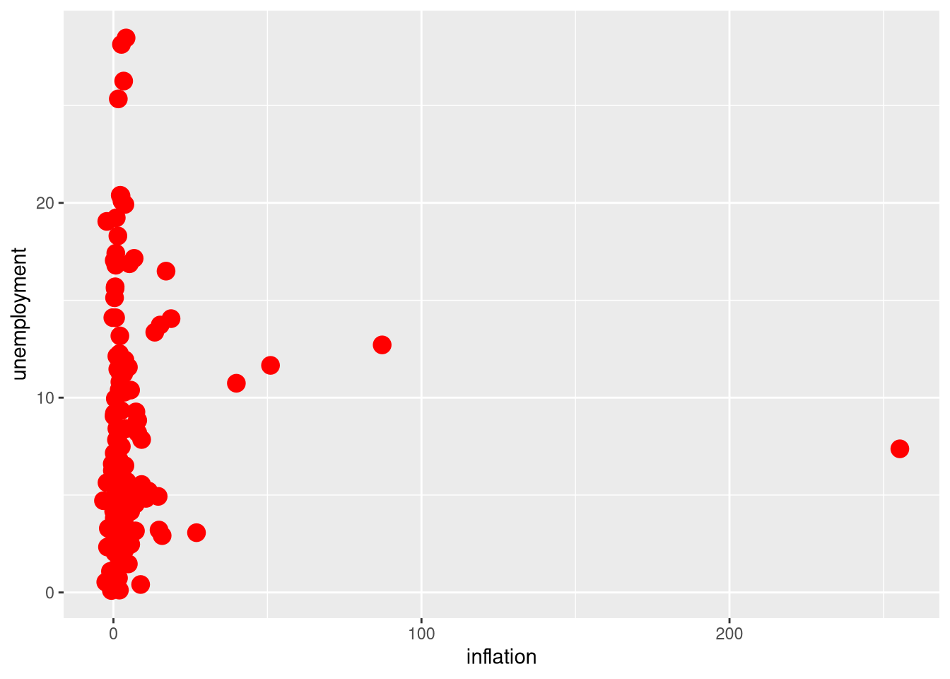
As you’ll see in the R output for the example here, ggplot() spits out a warning whenever the variables you’re plotting have missing data. Don’t worry when you see this warning — unless you expected that nothing would be missing, in which case you should go back and investigate further.
If you’re planning to present your data visualizations to other people — including in your problem sets for this course — you need to label the axes and provide a title so the audience understands what they’re looking at. The labs() function accomplishes this.
df_wdi |>
  ggplot(aes(x = inflation, y = unemployment)) +
  geom_point(size = 4, color = "red") +
  labs(
    title = "The global macroeconomy in 2019",
    subtitle = "Back before the post-pandemic economy reminded everyone that they hate inflation",
    x = "Inflation rate (percentage points)",
    y = "Unemployment rate (percentage points)"
  )
Warning: Removed 46 rows containing missing values or values outside the scale
range (`geom_point()`).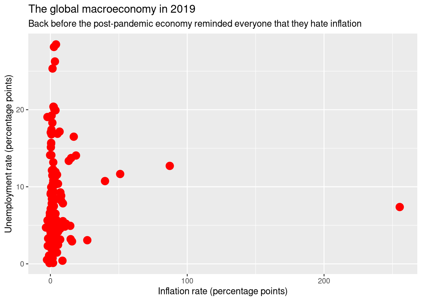
One last optional note on plotting and aesthetics. I really don’t like the big ugly gray box that ggplot puts behind every graph by default. I prefer the theme provided by the (unfortunately stupidly named) cowplot package. So before I start making ggplots, I load this package and set its theme as the default.
# Load cowplot and default to it
library("cowplot")
theme_set(
  theme_cowplot()
)

# Same code now produces a less hideous-looking plot
df_wdi |>
  ggplot(aes(x = inflation, y = unemployment)) +
  geom_point(size = 4, color = "red") +
  labs(
    title = "The global macroeconomy in 2019",
    subtitle = "Back before the post-pandemic economy reminded everyone that they hate inflation",
    x = "Inflation rate (percentage points)",
    y = "Unemployment rate (percentage points)"
  )
Warning: Removed 46 rows containing missing values or values outside the scale
range (`geom_point()`).
If I gridlines for readability, I’ll add a background_grid() specifying which axes I want them on.
df_wdi |>
  ggplot(aes(x = inflation, y = unemployment)) +
  geom_point(size = 4, color = "red") +
  labs(
    title = "The global macroeconomy in 2019",
    subtitle = "Back before the post-pandemic economy reminded everyone that they hate inflation",
    x = "Inflation rate (percentage points)",
    y = "Unemployment rate (percentage points)"
  ) +
  background_grid("xy")
Warning: Removed 46 rows containing missing values or values outside the scale
range (`geom_point()`).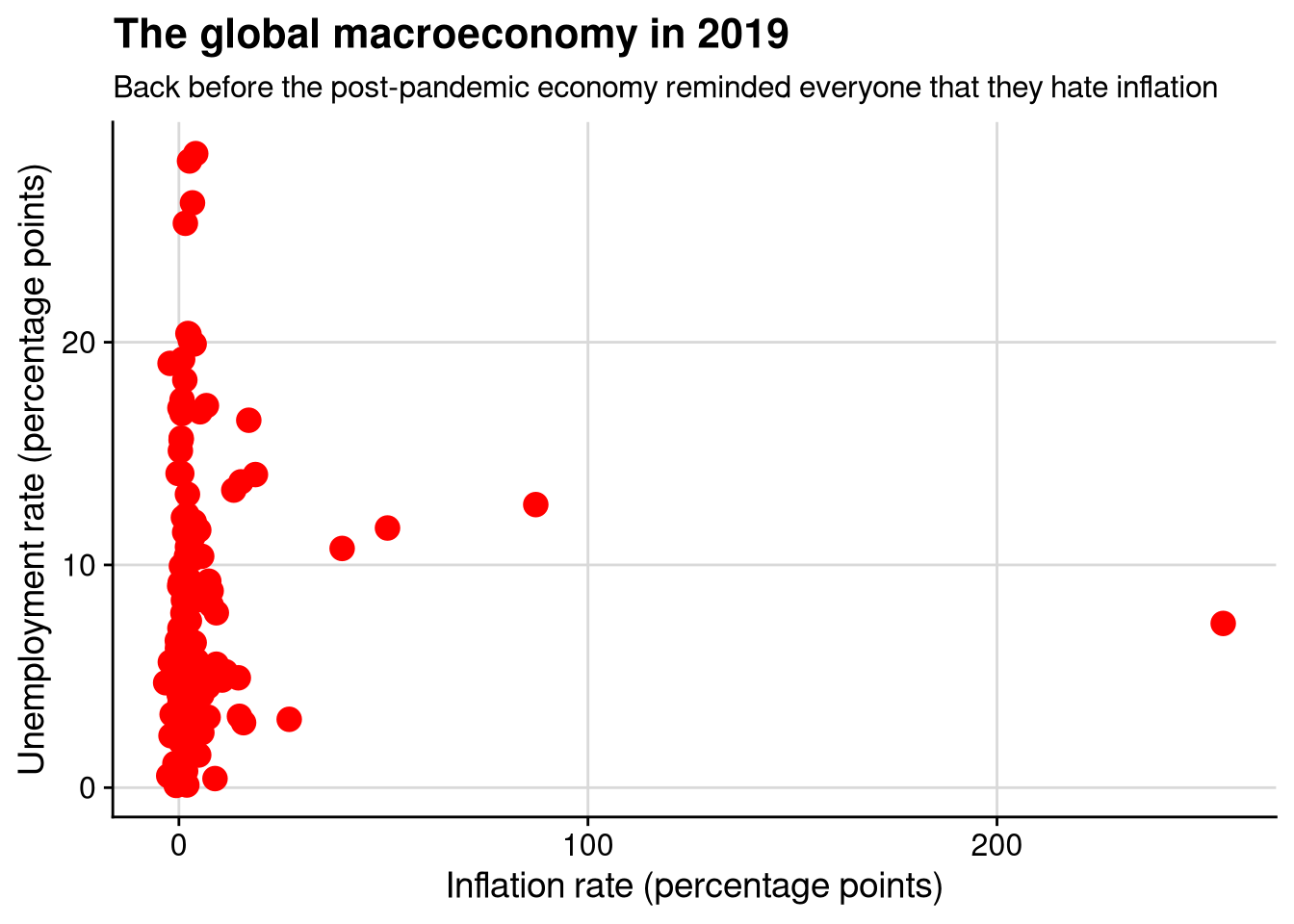
Even by the end of this chapter, we will have only scratched the surface of the plotting options available in ggplot(). You can look at the extensive ggplot documentation if you want a comprehensive guide to all of the plotting functions and their arguments. Personally, I find the documentation so overwhelming that I typically just ask ChatGPT which ggplot functions I need to accomplish what I’m looking for.
A histogram lets us look at the distribution of a continuous variable. For example, let’s take a look at the distribution of GDP growth across countries in 2019.
df_wdi |>
  ggplot(aes(x = gdp_growth)) +
  geom_histogram()
`stat_bin()` using `bins = 30`. Pick better value with `binwidth`.Warning: Removed 7 rows containing non-finite outside the scale range
(`stat_bin()`).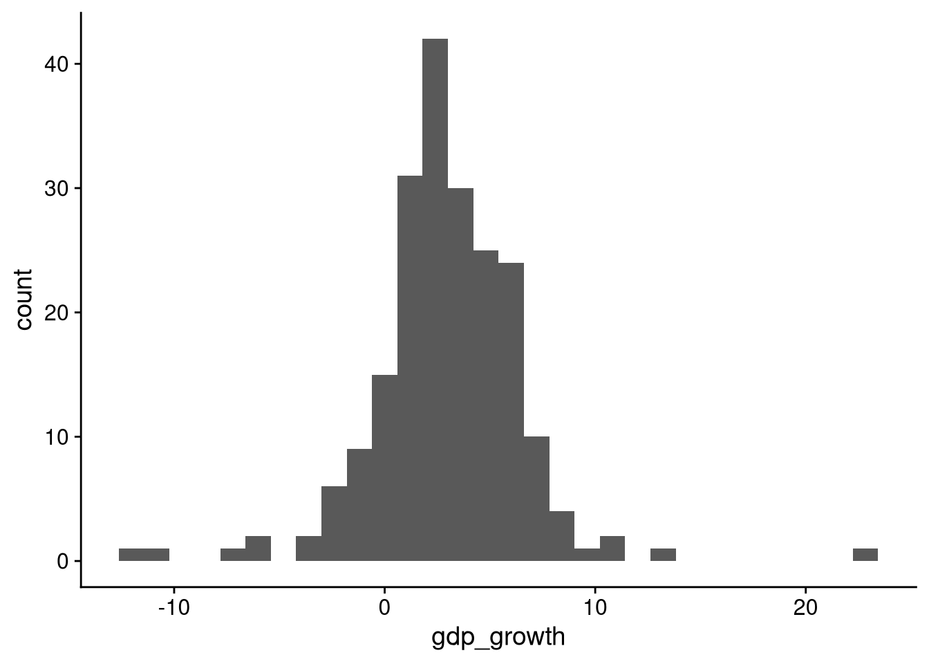
A histogram shows how much of the data falls into different slices, or “bins”. Looking at the histogram here, we see that a majority of countries had positive economic growth in 2019, but a substantial minority had negative growth. The vast majority of the data falls between about -3% growth and +8% growth, with only a few outliers outside that range.
A more full-featured, aesthetically pleasing (at least to me), audience-friendly version of the same histogram might look like this:
df_wdi |>
  ggplot(aes(x = gdp_growth)) +
  geom_histogram(color = "black", fill = "lightblue", binwidth = 1) +
  geom_vline(xintercept = 0, linetype = "dashed") +
  labs(
    x = "GDP growth (percentage points)",
    y = "Number of countries",
    title = "Worldwide economic growth in 2019"
  ) +
  background_grid("x")
Warning: Removed 7 rows containing non-finite outside the scale range
(`stat_bin()`).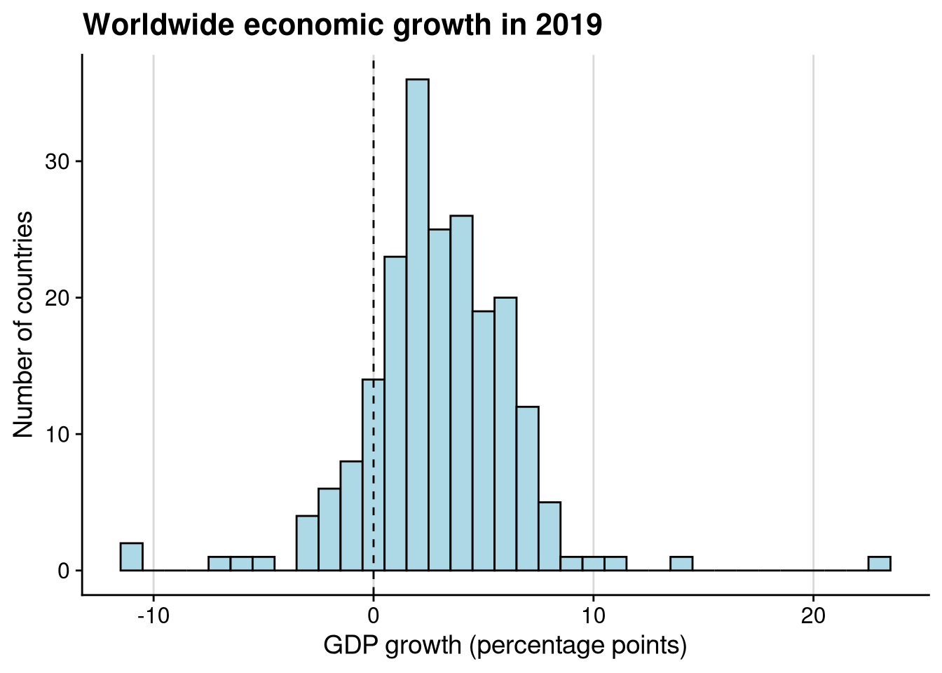
Here’s what I added to the original plot code:
Arguments to geom_histogram() changing the look of the histogram itself
color: outline color for each barfill: color of each barbinwidth: width of each bar, which I set to 1 percentage point to make it a bit easier to interpretgeom_vline() to add a vertical line separating negative (below 0) from positive (above 0) growth, additionally specifying that the line should be dashed
labs() to change the x- and y-axis labels, as well as add a title
background_grid() adding guides along the x-axis
In order to reduce distraction and focus on the critical part of each chunk of ggplot code, I am not doing things like adding titles, editing axis labels, adding colors, or changing the theme in the remainder of the plots here. This is a “Do as I say, not as I do” situation. The data visualizations you present, both in your problem sets and just generally in your professional life, should have quality axis labels, titles, and aesthetics.
Sometimes you will see a density plot used in place of a histogram. To make a density plot, just replace geom_histogram() with geom_density().
df_wdi |>
  ggplot(aes(x = gdp_growth)) +
  geom_density()
Warning: Removed 7 rows containing non-finite outside the scale range
(`stat_density()`).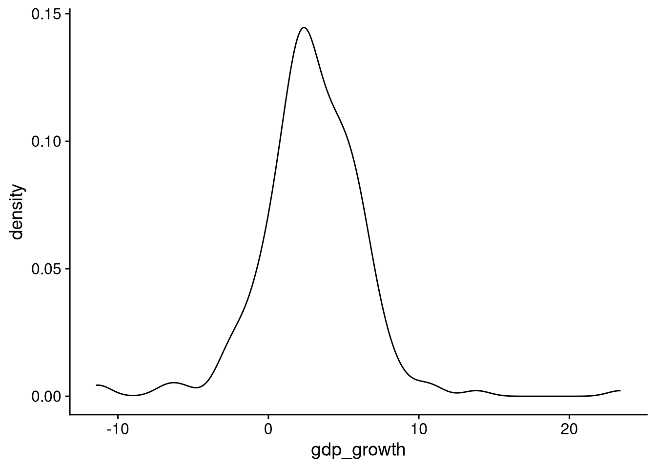
There are two main differences between a density plot and a histogram:
Instead of putting the data in discrete bins, the density plot uses statistical calculations to “smooth” the distribution.
Instead of the y-axis telling how many observations fall into each bin, it is scaled so that the total area under the curve equals 1.0. (In case you’re curious, this is to mimic a probability density function, hence the name “density plot.”)
When I’m truly just plotting the distribution of a single variable, I prefer a histogram over a density plot because it’s easier to interpret. However, the smoothness of density plots can make them better for overlaid comparisons of the distribution of a variable across groups, as we’ll see below.
The best way to visualize the distribution of a categorical variable is with a simple bar chart. In non-academic sources you’ll often see circular pie charts used to visualize the distribution of categories. Scientists don’t like pie charts, in part because it’s much harder for the human brain to compare slice areas than it is to compare bar heights, and in part because pie charts are poorly suited for variables with many categories.
To create a bar chart for a categorical variable in ggplot(), we set the x-axis to be the variable we want to visualize, and then use the geom_bar() geometry. As an example, let’s look at the distribution of regions for the countries in our WDI data.
df_wdi |>
  ggplot(aes(x = region)) +
  geom_bar()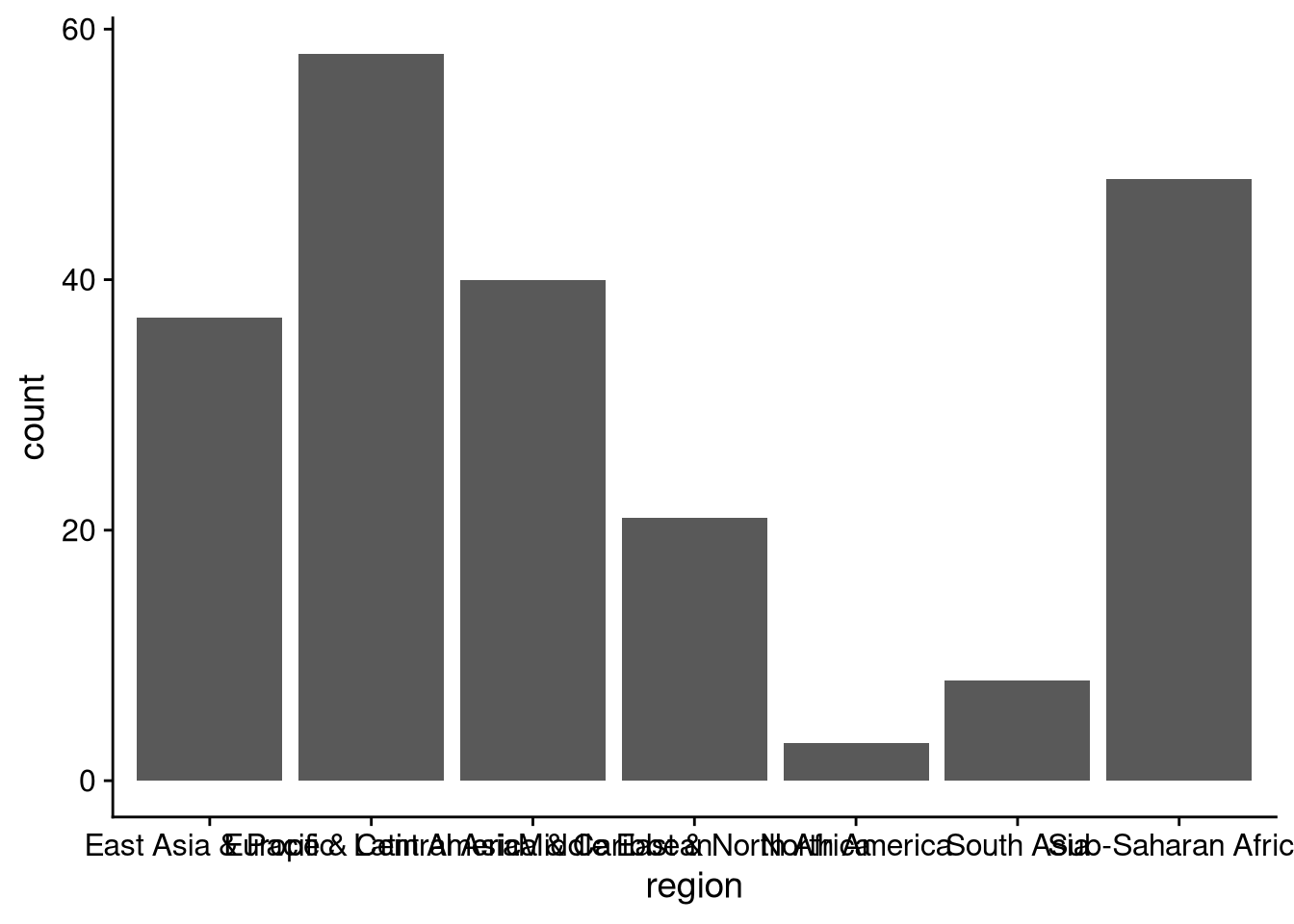
The default output here is unreadable because the axis labels overlap. That means we need to work more — if ggplot() (or whatever data visualization software you’re using) spits out incomprehensible output, you don’t get to say “Welp, that’s just what the computer told me” and move on. If you’re planning to show this data visualization to other people, then you need to put in the work to make the computer give you something both readable and accurate.
One option would be to modify the data frame to shorten the axis labels, perhaps using case_when() within mutate(). But it would be even easier to reorient the bar chart so the labels are on the y-axis instead of the x-axis.
df_wdi |>
  ggplot(aes(y = region)) +
  geom_bar()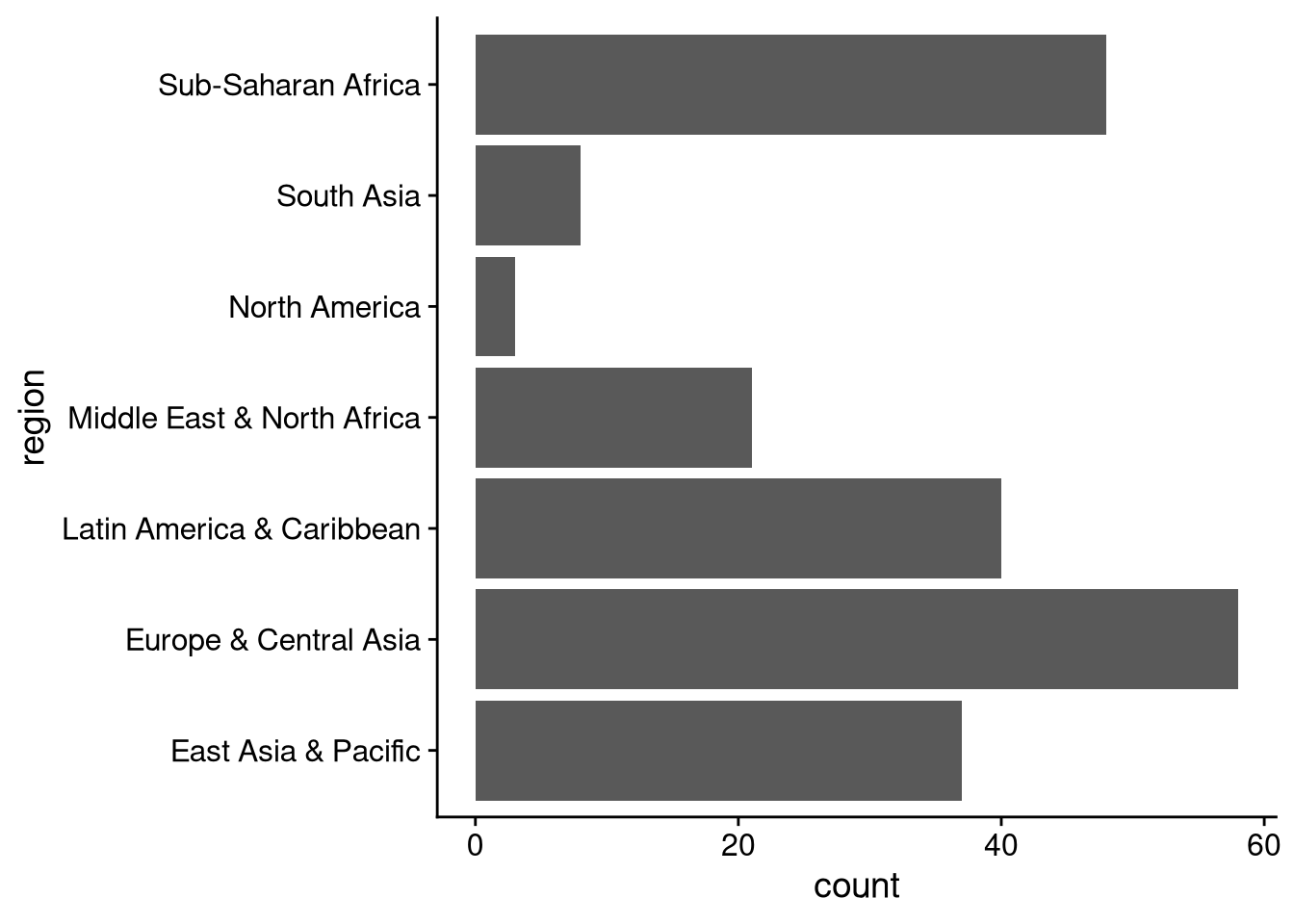
The bars here represent the raw number of observations in each category. What if we wanted the percentage or proportion instead? Then we need to edit our code a bit:
Group and summarize to calculate the proportion of observations in each category.
Use geom_col() in place of geom_bar(), being sure to instruct ggplot to put our proportion values on the x-axis.
df_wdi |>
  group_by(region) |>
  summarize(number = n()) |>
  mutate(proportion = number / sum(number)) |>
  ggplot(aes(x = proportion, y = region)) +
  geom_col()
If you don’t look carefully at the x-axis, this looks just like the previous bar chart. The difference is that now the x-axis represents proportions. For example, you can tell immediately that Europe and sub-Saharan Africa each account for more than 20% of countries.
To see the proportions and the raw number in each category, you can use geom_text() to overlay the raw numbers. The hjust = -0.3 argument puts the numbers just after each bar ends (I had to fiddle around with trial and error to get the right value).
df_wdi |>
  group_by(region) |>
  summarize(number = n()) |>
  mutate(proportion = number / sum(number)) |>
  ggplot(aes(x = proportion, y = region)) +
  geom_col(color = "black", fill = "gray70") +
  geom_text(aes(label = number), hjust = -0.3)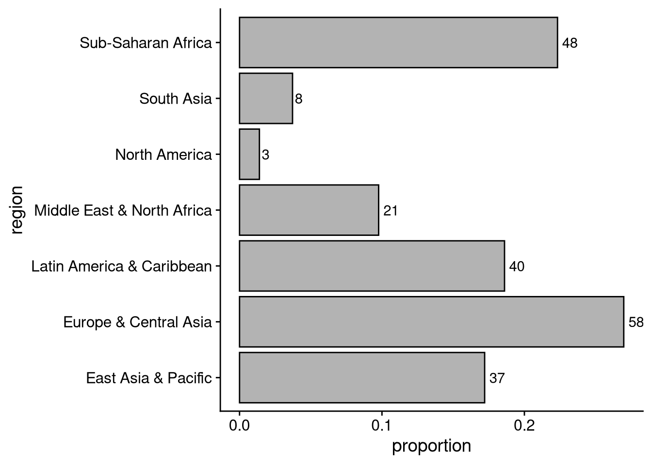
When we put a categorical variable on the x-axis, ggplot() will default to going in alphabetical order from left to right. When we put one on the y-axis, it defaults to alphabetical order from bottom to top. I find the y-axis behavior annoying, as I think we are more naturally inclined to read from top to bottom.
If you want to change the order of labels on the x- or y-axis, use xlim() or ylim() respectively. You can also use these functions if you only want to plot a subset of categories — just omit the label for any category you don’t want to appear.
# Alphabetical order from top to bottom
region_labels <- unique(df_wdi$region)  # list of region names
region_labels <- sort(region_labels)    # put in alphabetical order
region_labels <- rev(region_labels)     # reverse alphabetical order

df_wdi |>
  ggplot(aes(y = region)) +
  geom_bar() +
  ylim(region_labels)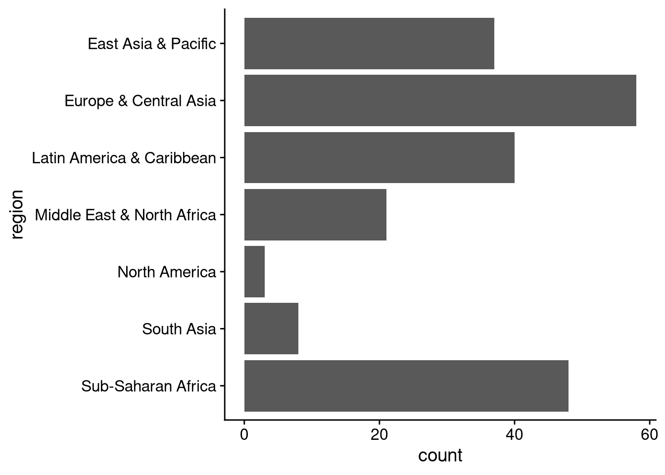
# Bespoke ordering (remember it'll go bottom to top)
# Note: any category not named in ylim() will be dropped from plot
df_wdi |>
  ggplot(aes(y = region)) +
  geom_bar() +
  ylim(
    "North America", "Latin America & Caribbean",
    "Europe & Central Asia", "South Asia"
  )
Warning: Removed 106 rows containing non-finite outside the scale range
(`stat_count()`).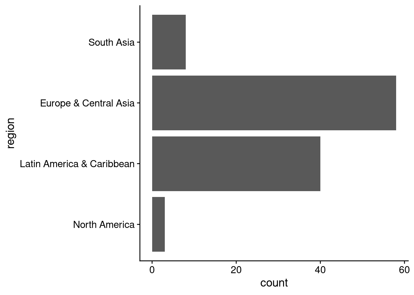
So far we have just seen how to visualize the distribution of a single variable. But data visualization is an especially powerful tool to learn and communicate about relationships between two or more variables.
The World Bank categorizes countries into four levels: low income, lower middle income, upper middle income, and high income. Let’s look for regional differences in the distribution of these income categories.
One way to visualize the distribution of income categories across regions is to make a separate bar chart of income levels for each region. The facet_wrap() command makes this easy. To make a separate plot for each level of a variable, just add facet_wrap(~ variable_name) to your series of ggplot commands. In our case, the variable we want to use is region.
df_wdi |>
  ggplot(aes(y = income)) +
  geom_bar() +
  facet_wrap(~ region) +
  panel_border()  # optional: thin border around each facet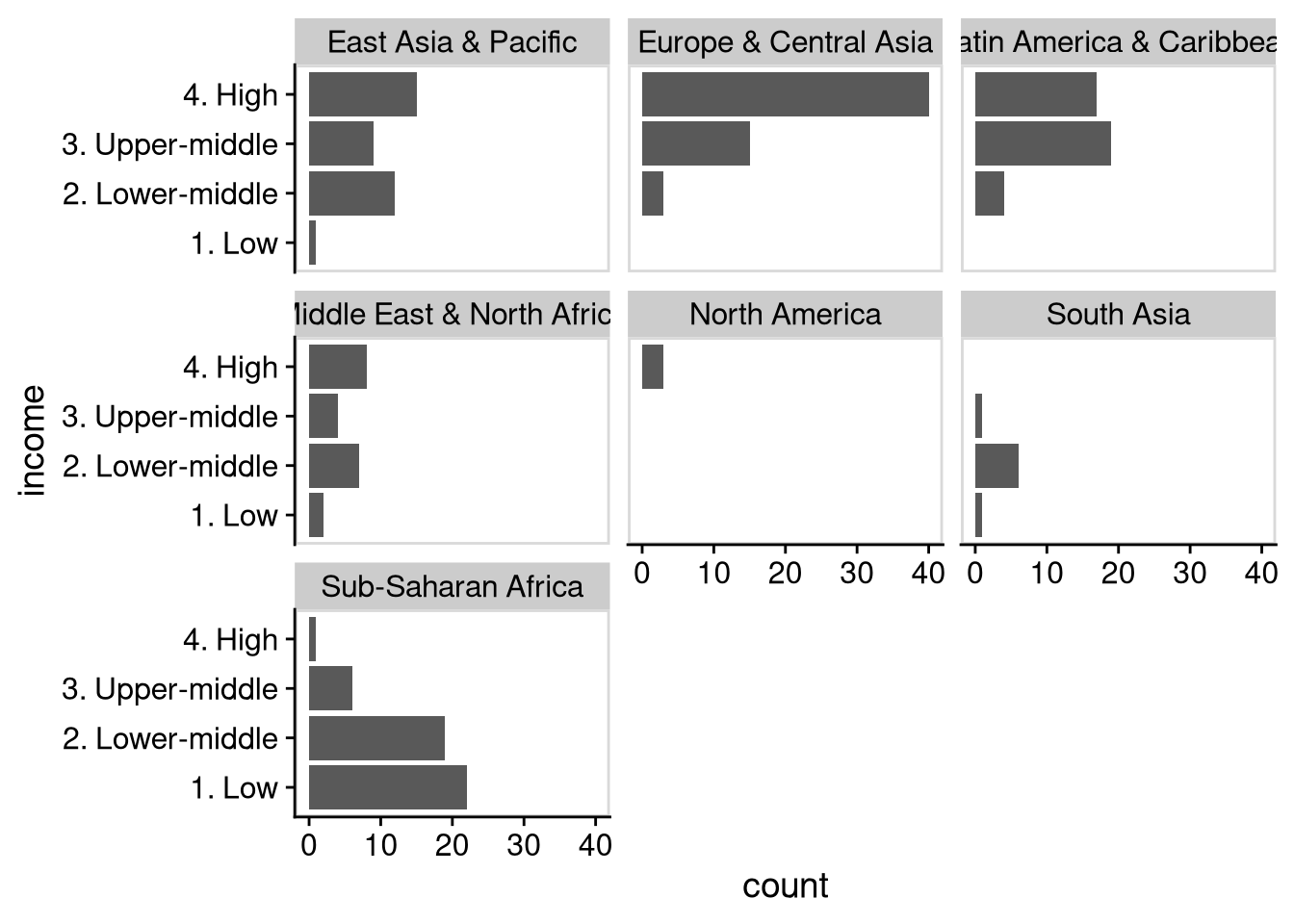
We see here that almost all of the countries categorized as “low income” are in sub-Saharan Africa. Europe, Latin America, and North America consist primarily of upper income countries, while South Asia is mostly lower middle income countries. We see the most diversity in income level by country in the Middle East and in East Asia.
Another way to visualize the income composition by region is to make a single bar plot of countries across regions, with different colors for different income levels. We saw earlier that you can use the fill argument of geom_bar() to change the color of the bars generally, as in geom_bar(fill = "lightblue"). To make different colors depending on a variable, we need to put fill inside aes(), as in geom_bar(aes(fill = variable_name)). In this case, the variable we want to use is income.
df_wdi |>
  ggplot(aes(y = region)) +
  geom_bar(aes(fill = income))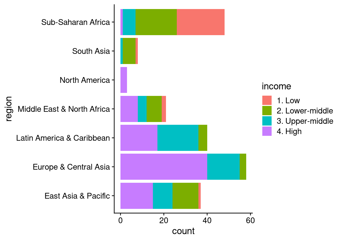
This plot easily lets us compare the number of countries across regions, while showing the income composition of each individual region. It’s a bit harder to make precise comparisons within each region, or to count the number of countries in a particular income category in a particular region. If we’re more interested in those comparisons, but for some reason don’t want to use facet_wrap(), we can make a “dodged” bar plot like in the example below.
df_wdi |>
  ggplot(aes(y = region)) +
  geom_bar(aes(fill = income), position = "dodge")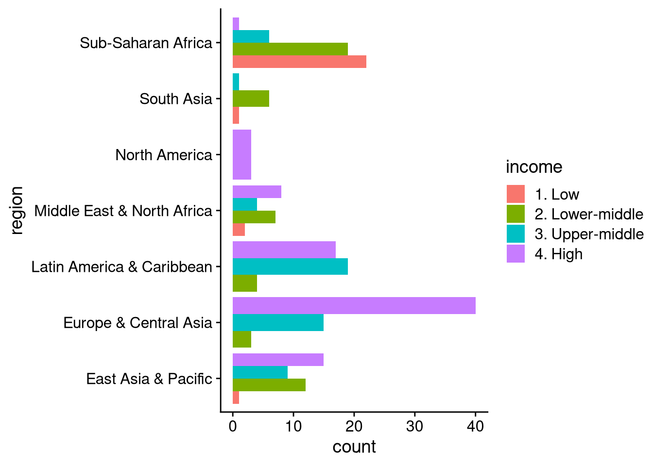
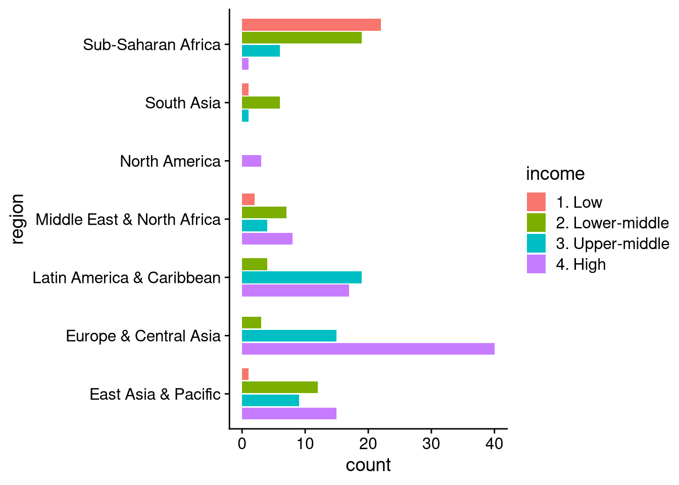
There are a couple of goofy things about the default dodged bar plot. First, the width of the bar changes when some income categories aren’t represented within a region (e.g., North America, where all three countries are high income). Second, the bars have high income at the bottom and go down from there, while the legend goes in the opposite direction. The following code, using position = position_dodge2(), fixes these issues.
df_wdi |>
  ggplot(aes(y = region)) +
  geom_bar(
    aes(fill = income),
    position = position_dodge2(
      preserve = "single",
      reverse = TRUE
    )
  )
How does the rate of economic growth vary across regions of the world? Above we saw how to visualize the overall distribution of growth using histograms. One way to analyze region-by-region variation would be to make a separate histogram for each region, using facet_wrap() like we did when visualizing the relationship between two categorical variables.
df_wdi |>
  ggplot(aes(x = gdp_growth)) +
  geom_histogram(binwidth = 1.0) +
  facet_wrap(~ region, scales = "free_y")
Warning: Removed 7 rows containing non-finite outside the scale range
(`stat_bin()`).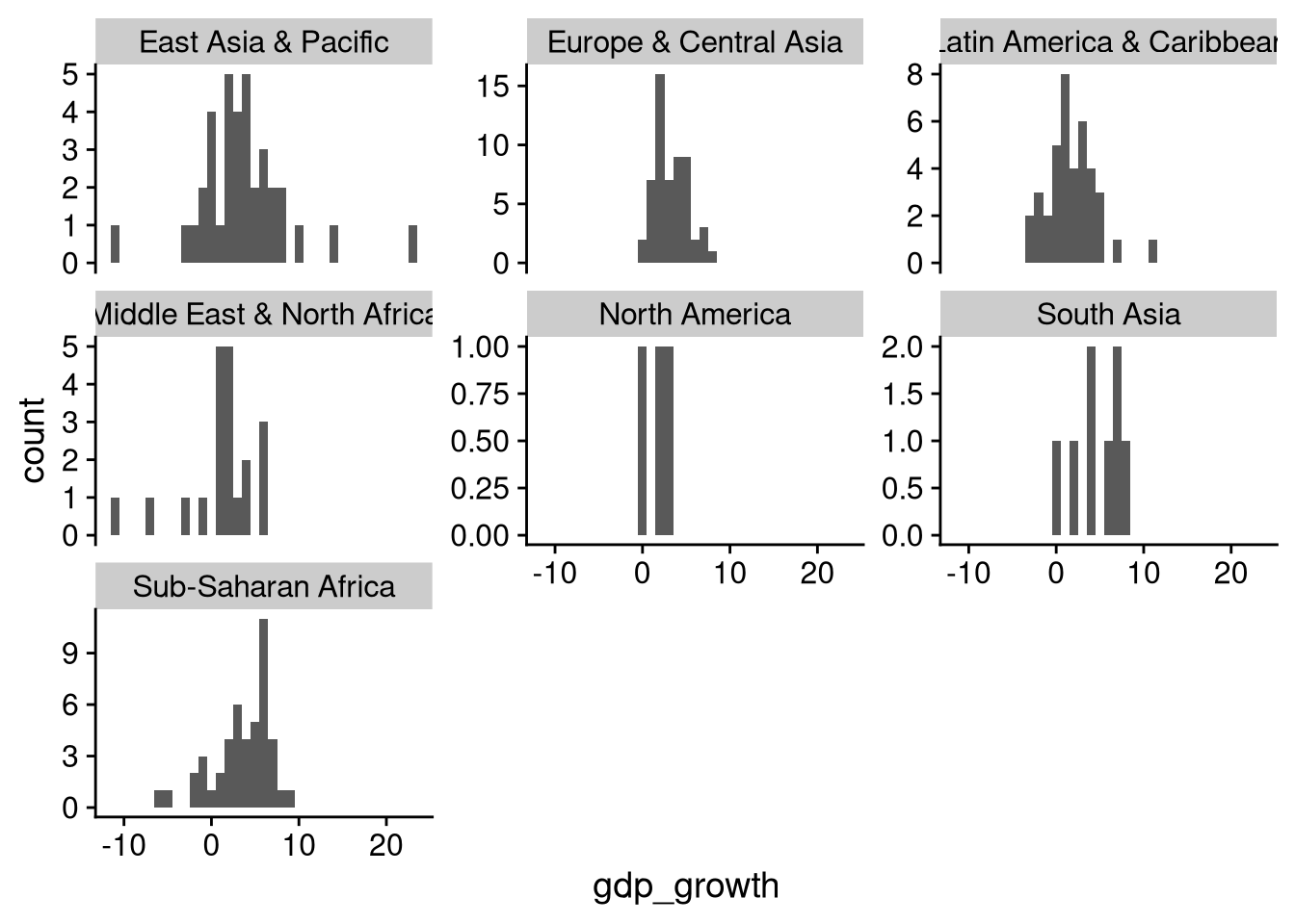
The scales = "free_y" argument in facet_wrap() allows each “facet” of the plot to have a different y-axis. Without this, the bars would be much shorter for regions like North America and South Asia that don’t have as many countries, making it harder to visually gauge the central tendency and spread for these regions with fewer countries.
You can also use overlapping density plots to compare the distribution of a continuous variable across categories of a discrete variable. This would probably be too messy with seven overlapping plots, but it can be useful for two or three categories. For example, let’s use overlapping density plots to compare the distribution of growth rates in East Asia to those in South Asia.
df_wdi |>
  filter(region == "East Asia & Pacific" | region == "South Asia") |>
  ggplot(aes(x = gdp_growth)) +
  geom_density(
    aes(fill = region),  # different colors for different regions
    alpha = 0.25,        # 75% transparency
    color = "black"      # black outline
  )
Warning: Removed 1 row containing non-finite outside the scale range
(`stat_density()`).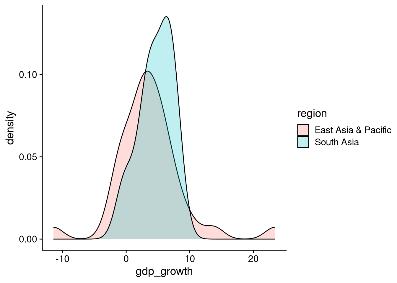
There are a couple of evident takeaways from this overlapping density plot. First, average growth is a bit higher in South Asia than in East Asia. Second, the spread of the distribution of growth rates is wider in East Asia than in South Asia.
There are more compact ways to view how the distribution of a continuous variable varies across levels of a categorical variable. One of these is a box and whiskers plot, also called a box plot.
df_wdi |>
  ggplot(aes(x = gdp_growth, y = region)) +
  geom_boxplot() +
  background_grid("x", minor = "x")  # "minor": adds thinner gridlines at halfway points
Warning: Removed 7 rows containing non-finite outside the scale range
(`stat_boxplot()`).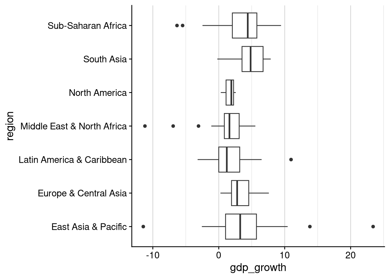
Each entry in the box plot gives us at least five pieces of information:
The thick line represents the median. For example, this plot shows that median growth in South Asia was just below 5%.
The rectangular “box” shows the 25th and 75th percentiles. For example, the 25th percentile in Latin America was about 0% growth, and the 75th percentile was about 2.5%. (If you forgot what “percentile” means, go back and reread Section 3.3.3.)
The “whisker” lines extend between:
The lowest value that is no more than 1.5 IQR below the 25th percentile. (IQR = distance between 75th and 25th percentile.)
The highest value that is no more than 1.5 IQR above the 75th percentile.
For example, other than a couple of low outliers (see below), observed growth rates in sub-Saharan Africa ranged from -2.5% to just below 10%.
Any observed values that are outside the “whisker” range are plotted individually. These can be thought of as outliers. For example, while the vast majority of countries in East Asia and the Pacific had growth rates between -3% and 10%, there was one outlier with growth below -10%, another with growth around 13.5%, and one last one with growth above 20%.
The violin plot is a compromise between the box plot and the faceted histogram. Like the box plot, it puts all of the categories together in one plot, rather than splitting up into many tiny plots. But like the histogram (or a density plot), it provides a visualization of the full distribution of the continuous variable across each category level, rather than using a few statistics to summarize the distribution.
df_wdi |>
  ggplot(aes(x = gdp_growth, y = region)) +
  geom_violin() +
  background_grid("x", minor = "x")
Warning: Removed 7 rows containing non-finite outside the scale range
(`stat_ydensity()`).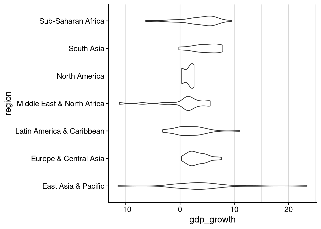
I personally think the choice between a box plot and a violin plot is a matter of judgment and aesthetics. It depends on what point about the data you’re trying to convey. Non-scientific audiences have trouble with both types of visualization in my experience, but probably less with box plots than with a violin plot.
All of the methods we have looked at so far involve visualizing the full distribution of the continuous variable across each different level of the categorical variable. Sometimes you may want to visualize a simpler summary, like just the mean and standard deviation of the continuous variable across categories.
To visualize this kind of summary across groups, first we need to calculate the statistics we want for each category. For example, let’s calculate the average growth rate and the standard deviation for each region.
df_wdi |>
  group_by(region) |>
  summarize(
    avg_growth = mean(gdp_growth, na.rm = TRUE),
    sd_growth = sd(gdp_growth, na.rm = TRUE)
  )
# A tibble: 7 × 3
region avg_growth sd_growth
<chr> <dbl> <dbl>
1 East Asia & Pacific 3.69 5.47
2 Europe & Central Asia 3.21 1.82
3 Latin America & Caribbean 1.77 2.80
4 Middle East & North Africa 0.979 4.10
5 North America 1.60 1.17
6 South Asia 4.66 2.68
7 Sub-Saharan Africa 3.49 3.37Missing data in an R data frame is marked with a special value called NA. Any kind of mathematical operation with an NA value will produce an NA.
1 + NA[1] NA0 * NA[1] NAmean(c(1, 2, 3, NA, 5, 6))[1] NASo if you take a mean() or median() or sd() and it returns NA, that means your input data has at least one missing value. If you want to ignore the missing values and calculate the average (or median or standard deviation…) of the non-missing values, just add the argument na.rm = TRUE to the function call, as in the code block above.
After calculating the summary statistics we want for each group, we will pipe the output into ggplot() to make a bar plot. Since we’re plotting a statistic we computed rather than counting up group membership, we will use geom_col() for the bar plot. We’ll also add the geom_errorbar() function to plot \(\pm 1\) standard deviation around each mean.
df_wdi |>
  group_by(region) |>
  summarize(
    avg_growth = mean(gdp_growth, na.rm = TRUE),
    sd_growth = sd(gdp_growth, na.rm = TRUE)
  ) |>
  ggplot(aes(x = avg_growth, y = region)) +
  geom_col() +
  geom_errorbar(
    aes(
      xmin = avg_growth - sd_growth,
      xmax = avg_growth + sd_growth
    ),
    width = 0.2
  )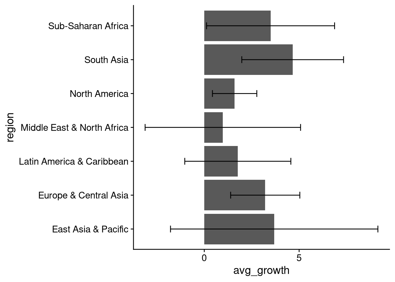
This is … ok. Bar plots can get weird when negative values are possible, as is the case with growth. The average growth is positive in each region, but the standard deviations are large enough that the error bars cross over into the negatives, making the plot overall somewhat hard to comprehend.
A better choice for summary statistics is often a dot plot, where we plot the same information as in a bar chart, but using dots instead of solid bars. We can use geom_point() to make a simple dot plot without error bars, or geom_pointrange() if we want to be a bit fancier.
## No error bars
df_wdi |>
  group_by(region) |>
  summarize(
    avg_growth = mean(gdp_growth, na.rm = TRUE),
    sd_growth = sd(gdp_growth, na.rm = TRUE)
  ) |>
  ggplot(aes(x = avg_growth, y = region)) +
  geom_point() +
  background_grid("x")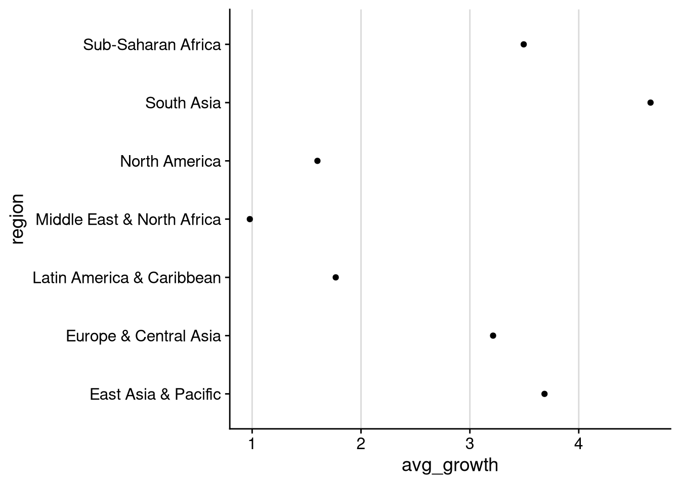
## With error bars
df_wdi |>
  group_by(region) |>
  summarize(
    avg_growth = mean(gdp_growth, na.rm = TRUE),
    sd_growth = sd(gdp_growth, na.rm = TRUE)
  ) |>
  ggplot(aes(
    x = avg_growth,
    y = region,
    xmin = avg_growth - sd_growth,
    xmax = avg_growth + sd_growth
  )) +
  geom_pointrange() +
  background_grid("x")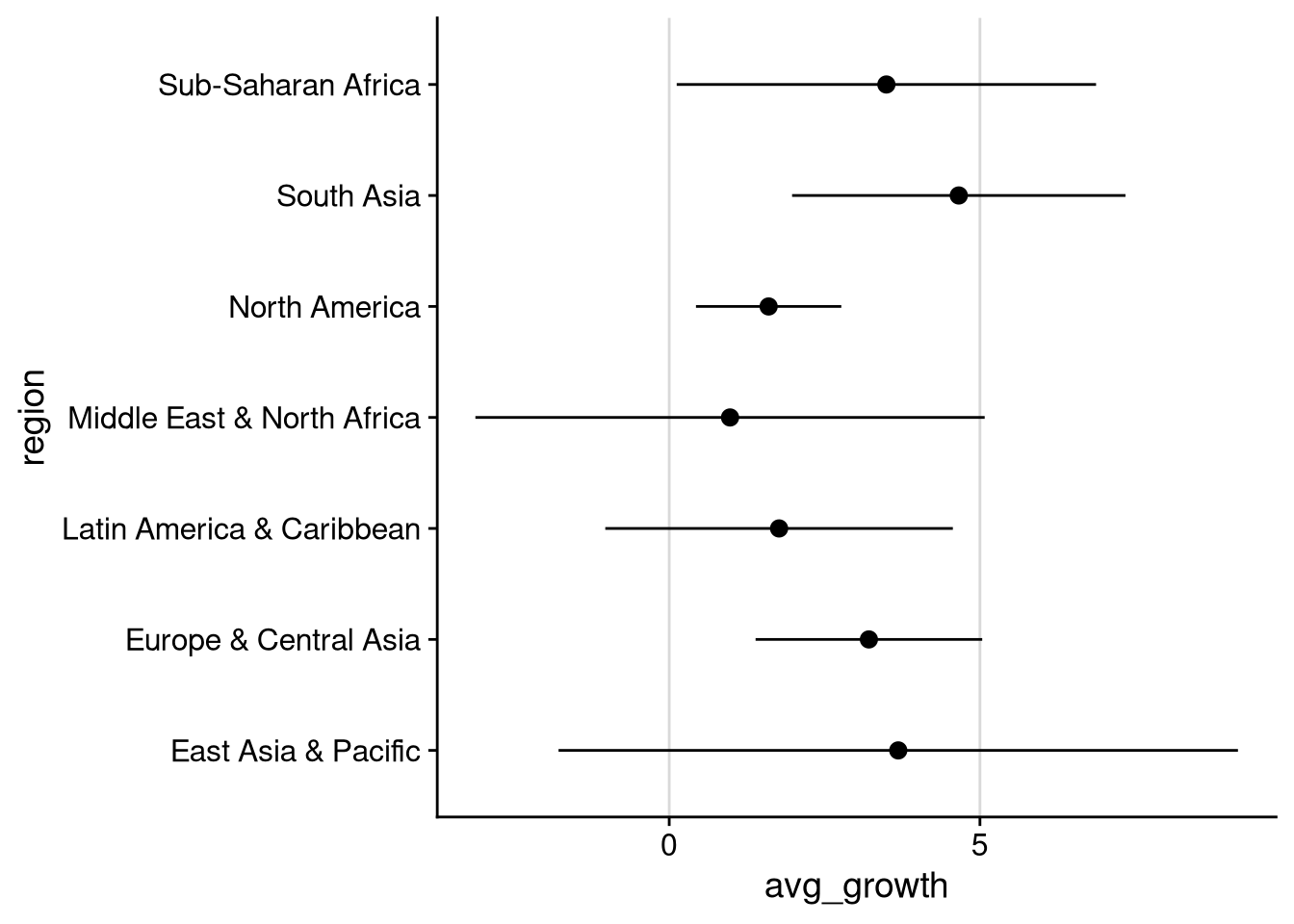
The second dot plot lets us clearly see the average growth rates and the range of “unsurprising” values (mean \(\pm\) 1 standard deviation) across regions. We see here that average growth is highest in South Asia. South Asia is also one of three regions — the others being Sub-Saharan Africa, North America, and Europe & Central Asia — where a negative growth rate would be more than one standard deviation below average. The lowest growth rates on average are in the Middle East & North Africa.
In general, the best way to visualize a relationship between two continuous variables is with a scatterplot. We use geom_point() to create scatterplots, as in the following example looking at the relationship between GDP per capita and life expectancy.
df_wdi |>
  ggplot(aes(x = gdp_per_capita, y = life_expectancy)) +
  geom_point()
Warning: Removed 5 rows containing missing values or values outside the scale
range (`geom_point()`).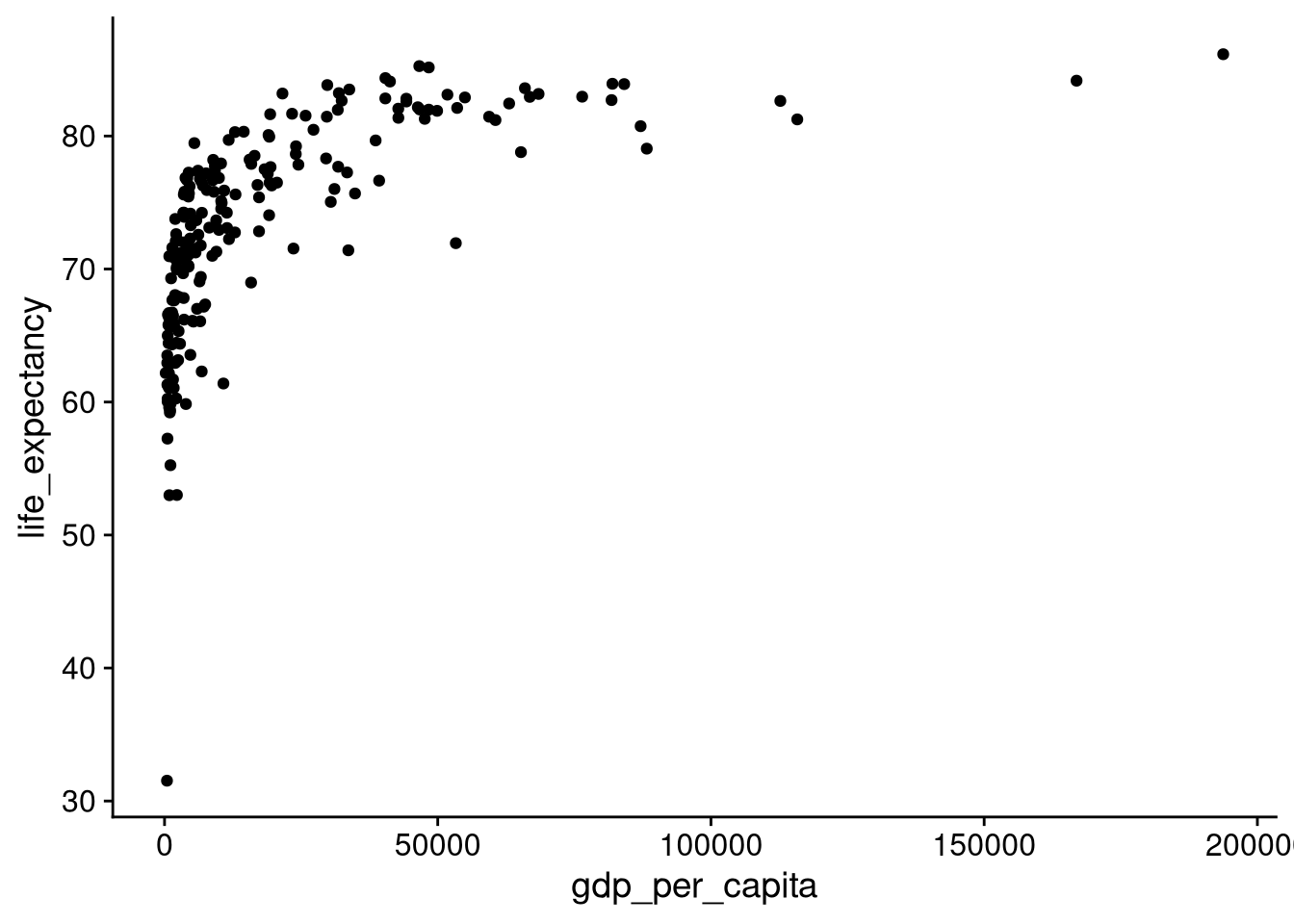
The point way up in the top right shows us that there was a country with a roughly $170K per capita GDP, where the life expectancy was almost 85 years old. At the other extreme, down in the bottom left, we see a cluster of countries with per capita GDP close to $0, with a life expectancy below 60 years old.
A scatterplot can give us a good idea of whether the correlation between two continuous variables is positive or negative.
Positively correlated: Above-average values of \(x\) tend to go with above-average values of \(y\), and below-average values of \(x\) tend to go with below-average values of \(y\).
In a scatterplot of positively correlated variables, the majority of the data will be in the top-right and bottom-left quadrants.
Negatively correlated: Above-average values of \(x\) tend to go with below-average values of \(y\), and below-average values of \(x\) tend to go with above-average values of \(y\).
In a scatterplot of negatively correlated variables, the majority of the data will be in the top-left and bottom-right quadrants.
No correlation is when knowing whether \(x\) is above or below average tells you little about whether \(y\) is above or below average, and vice versa.
In a scatterplot of variables with no correlation, the amount of data in the different quadrants will be roughly equal.
GDP per capita is positively correlated with life expectancy. In other words, countries with above-average GDP per capita tend to have above-average life expectancy. To see this, let’s overlay lines indicating the average GDP per capita and life expectancy in the data.
avg_gdp <- mean(df_wdi$gdp_per_capita, na.rm = TRUE)
avg_life <- mean(df_wdi$life_expectancy, na.rm = TRUE)

df_wdi |>
  ggplot(aes(x = gdp_per_capita, y = life_expectancy)) +
  geom_point() +
  geom_vline(xintercept = avg_gdp, linetype = "dashed") +
  geom_hline(yintercept = avg_life, linetype = "dashed")
Warning: Removed 5 rows containing missing values or values outside the scale
range (`geom_point()`).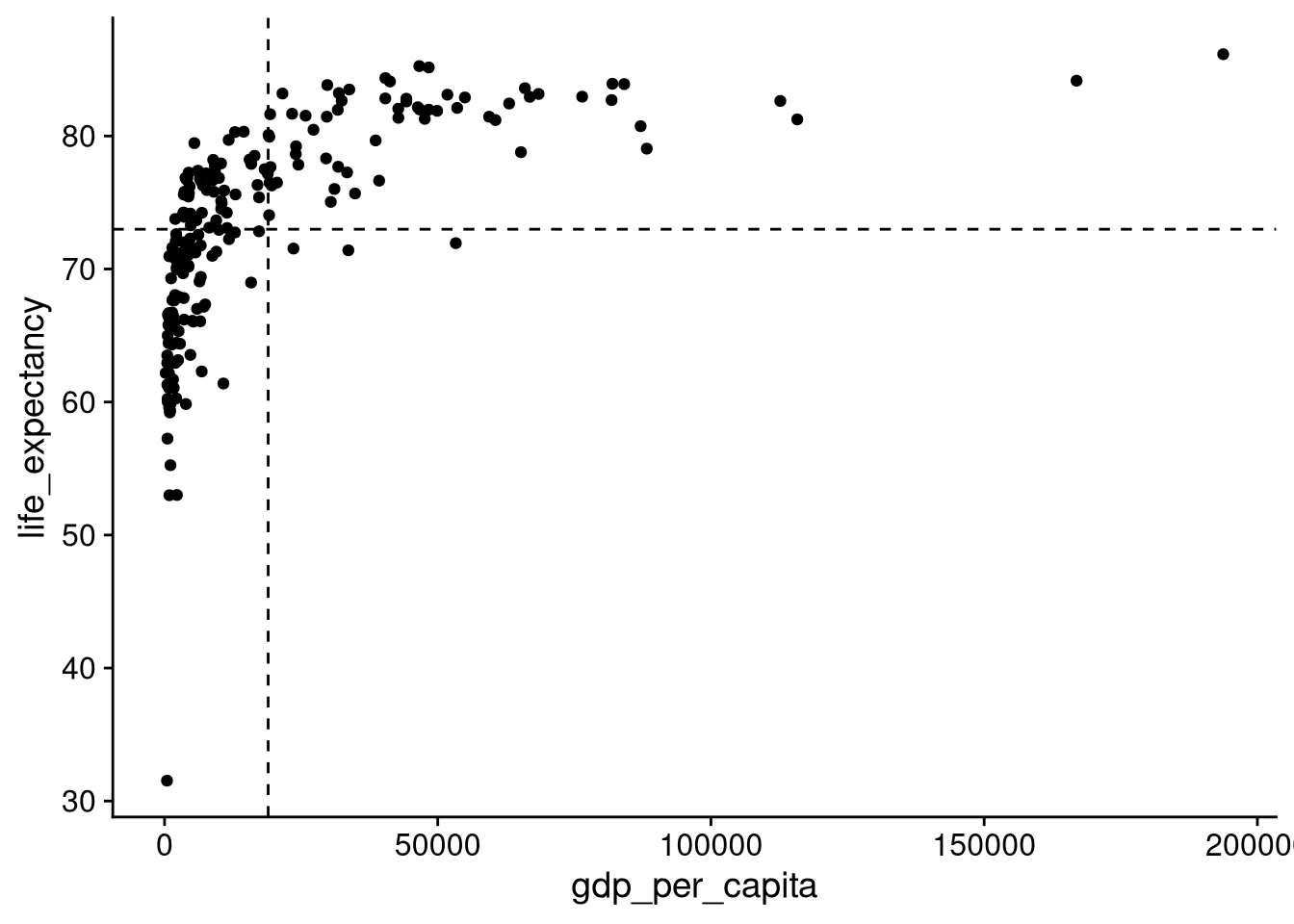
We see here that there is plenty of data in the top-right (above average on both GDP per capita and life expectancy) and bottom-left (below average on both). There is also a decent amount of data in the upper-left (below average GDP per capita, but above-average life expectancy). However, there is very little data in the bottom-right — every country with an above-average GDP per capita has an above-average life expectancy, except for three that are just slightly below average.
Another way to visualize the correlation is to overlay a trend line. We can do this by adding the geom_smooth() function.
df_wdi |>
  ggplot(aes(x = gdp_per_capita, y = life_expectancy)) +
  geom_point() +
  geom_smooth()
`geom_smooth()` using method = 'loess' and formula = 'y ~ x'Warning: Removed 5 rows containing non-finite outside the scale range
(`stat_smooth()`).Warning: Removed 5 rows containing missing values or values outside the scale
range (`geom_point()`).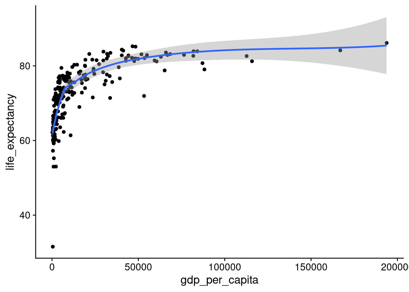
The blue line gives us a predicted value of \(y\) as a function of the value of \(x\). For example, for a country with a GDP per capita just above $0, the predicted life expectancy is about 62.5 years old. For a country with a GDP per capita of $25,000, the predicted life expectancy is just below 80. Finally, for a country with a GDP per capita of $50,000, the predicted life expectancy is just above 80. The gray band indicates the amount of uncertainty in the predicted average. In general, the prediction is less certain in ranges with less data, such as in the $100,000+ range for per capita GDP here.
You might want to know which countries correspond to which points on the scatterplot. To do that, you can switch out geom_point() for geom_text(), plotting text labels instead of dots. You’ll need to supply the label aesthetic to geom_text() to tell it where to get the labels from. Here, we’ll use the "iso3c" column with three-character country name abbreviations.
df_wdi |>
  ggplot(aes(x = gdp_per_capita, y = life_expectancy)) +
  geom_text(aes(label = iso3c))
Warning: Removed 5 rows containing missing values or values outside the scale
range (`geom_text()`).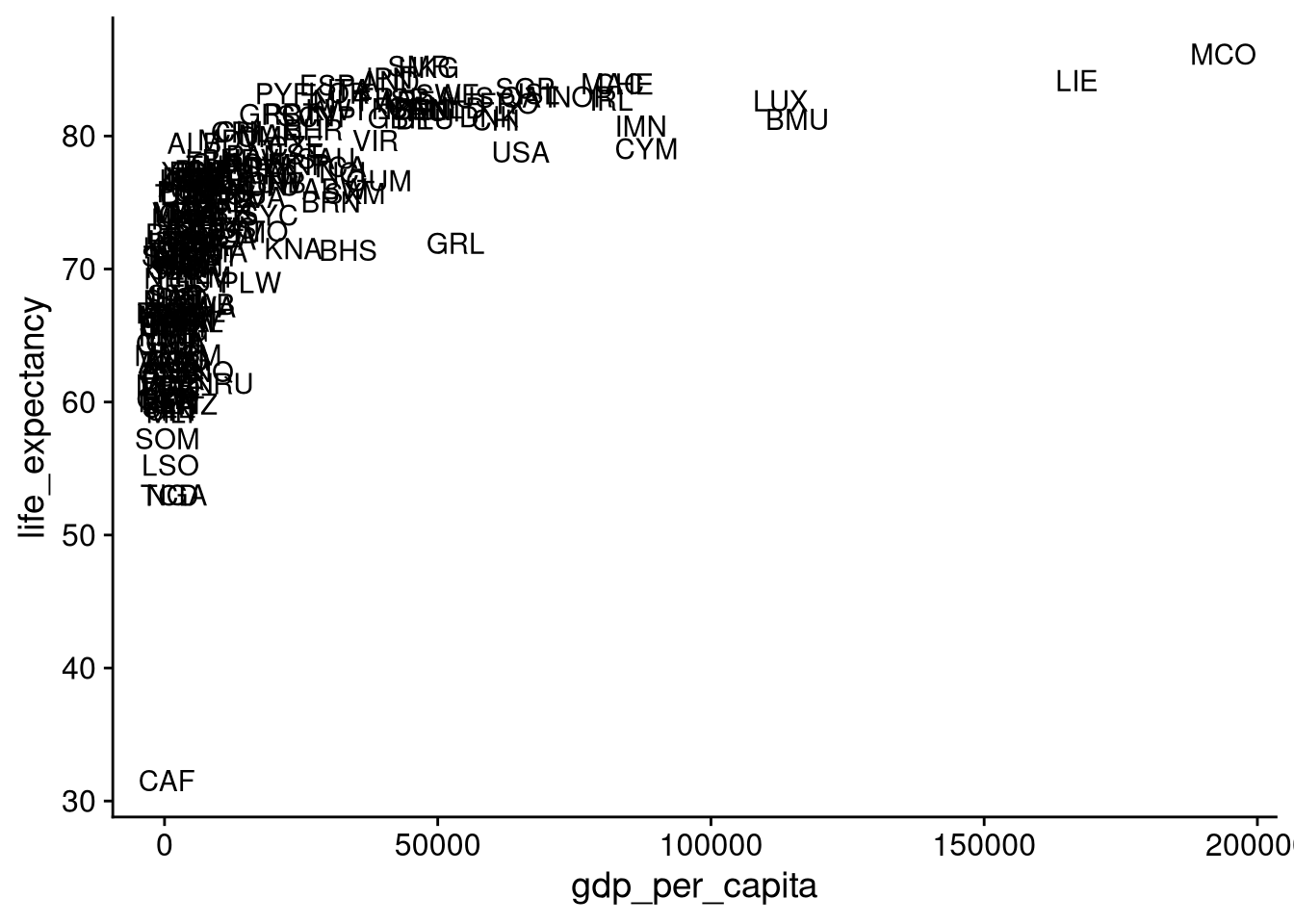
But with so many overlapping data points, this plot is tough to make sense of. When the geom_text() output is hard to read like this, I use the geom_text_repel() function from the ggrepel package to label the most distinctive points.
library("ggrepel")

df_wdi |>
  ggplot(aes(x = gdp_per_capita, y = life_expectancy)) +
  geom_point() +
  geom_text_repel(aes(label = country))
Warning: Removed 5 rows containing missing values or values outside the scale
range (`geom_point()`).Warning: Removed 5 rows containing missing values or values outside the scale
range (`geom_text_repel()`).Warning: ggrepel: 200 unlabeled data points (too many overlaps).
Consider increasing max.overlaps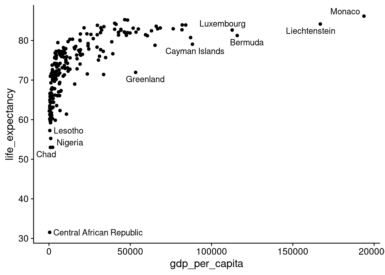
The default scatterplot is less useful when one or both variables has a highly skewed distribution, with outliers far away from the central tendency. Think about population, where China and India are each about triple the size of the next-largest country.
df_wdi |>
  ggplot(aes(x = population)) +
  geom_histogram()
`stat_bin()` using `bins = 30`. Pick better value with `binwidth`.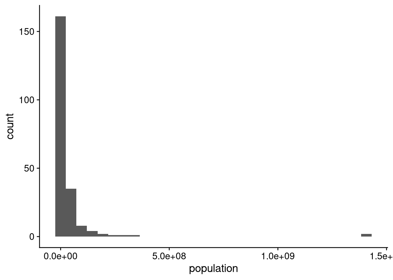
If we try to make a scatterplot of life expectancy against country population, we end up with something that’s very hard to read.
df_wdi |>
  ggplot(aes(x = population, y = life_expectancy)) +
  geom_point()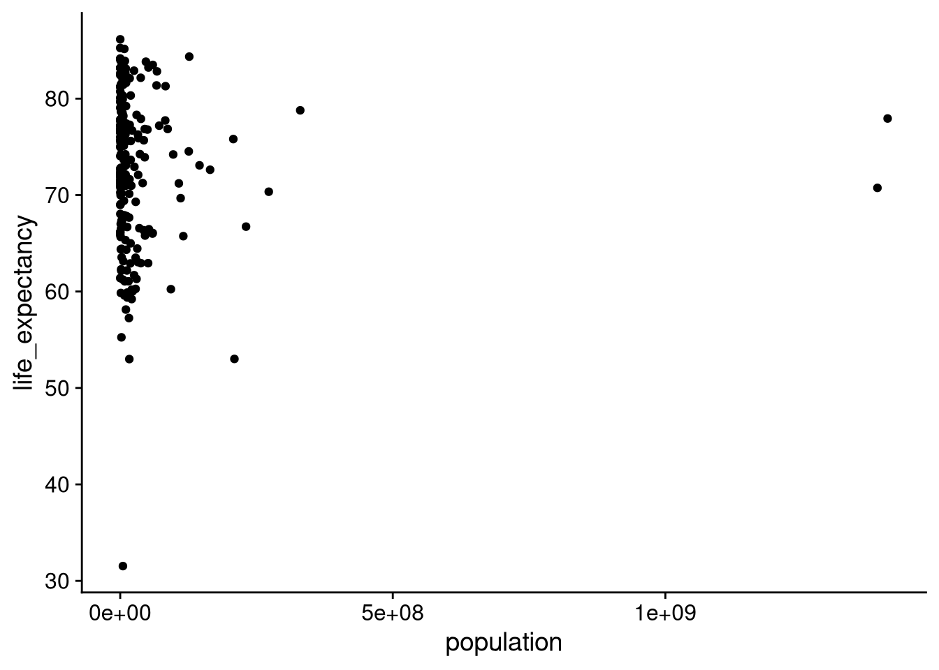
We can deal with this issue by putting population on a logarithmic scale. By default, each “tick” along the \(x\)-axis moves us up by the same number of people, which is why China and India are so far out compared to all the other countries. When we use a logarithmic scale, each “tick” instead represents an increase by a factor of ten. Specifically, the distance on the \(x\)-axis between a country with 100,000 residents and one with 1,000,000 residents will be the same as between a country with 10,000,000 residents and one with 100,000,000 residents.
df_wdi |>
  ggplot(aes(x = population, y = life_expectancy)) +
  geom_point() +
  scale_x_log10()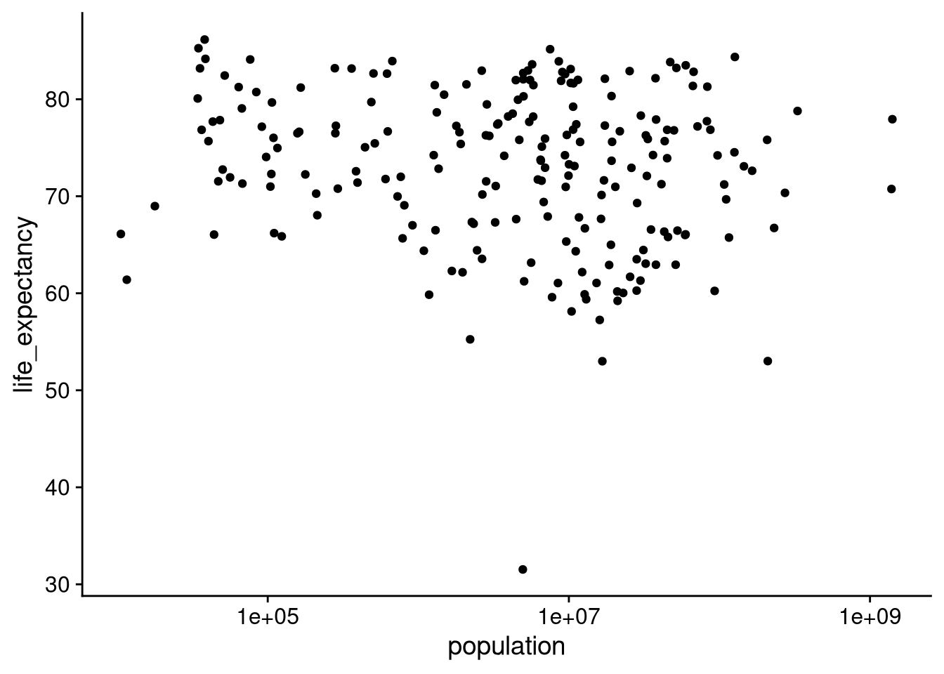
Looking at it this way, we can see much more clearly that there is close to no correlation between population size and life expectancy.
A lot of time in political science, our data has some kind of geographical component. A natural way to visualize relationships with a geographical variable is by making maps! Making a map requires a bit more work up front than other data visualizations, so let’s get into it.
Let’s start by loading the two additional packages we’ll need to make maps and work with mapping data.
library("maps")
library("countrycode")
We can access the (ugly and difficult to understand) raw mapping data by calling map_data("world"). This returns a data frame with the information that R needs to plot the countries of the world. In order to map variables from the World Development Indicators, we need to merge variables from our df_wdi into this data frame. The annoying part is that the default map data only has full country names, not the standardized 3-character country codes. The following block of code adds those to the map data, then merges in our WDI data.
df_world_map <- map_data("world") |>
  as_tibble() |>
  rename(name = region) |>
  mutate(iso3c = countryname(name, destination = "iso3c")) |>
  left_join(df_wdi, by = "iso3c")
Warning: There were 2 warnings in `mutate()`.
The first warning was:
ℹ In argument: `iso3c = countryname(name, destination = "iso3c")`.
Caused by warning:
! Some values were not matched unambiguously: Ascension Island, Azores, Barbuda, Canary Islands, Chagos Archipelago, Grenadines, Heard Island, Madeira Islands, Micronesia, Saba, Saint Martin, Siachen Glacier, Sint Eustatius, Virgin Islands
ℹ Run `dplyr::last_dplyr_warnings()` to see the 1 remaining warning.df_world_map# A tibble: 99,338 × 18
long lat group order name subregion iso3c country year
<dbl> <dbl> <dbl> <int> <chr> <chr> <chr> <chr> <dbl>
1 -69.9 12.5 1 1 Aruba <NA> ABW Aruba 2019
2 -69.9 12.4 1 2 Aruba <NA> ABW Aruba 2019
3 -69.9 12.4 1 3 Aruba <NA> ABW Aruba 2019
4 -70.0 12.5 1 4 Aruba <NA> ABW Aruba 2019
5 -70.1 12.5 1 5 Aruba <NA> ABW Aruba 2019
6 -70.1 12.6 1 6 Aruba <NA> ABW Aruba 2019
7 -70.0 12.6 1 7 Aruba <NA> ABW Aruba 2019
8 -70.0 12.6 1 8 Aruba <NA> ABW Aruba 2019
9 -69.9 12.5 1 9 Aruba <NA> ABW Aruba 2019
10 -69.9 12.5 1 10 Aruba <NA> ABW Aruba 2019
# ℹ 99,328 more rows
# ℹ 9 more variables: gdp_per_capita <dbl>, gdp_growth <dbl>,
# population <dbl>, inflation <dbl>, unemployment <dbl>,
# life_expectancy <dbl>, region <chr>, income <chr>, lending <chr>Just to be clear on what each line of the above code block accomplishes:
map_data("world") retrieves the data frame of raw mapping data.as_tibble() turns it from a standard R data frame into a tidyverse-style “tibble.” I only did this so I could print it in Quarto without 1000 rows showing up.rename(name = region) renames the region column in the mapping data, which actually stores country names rather than regions, to be more sensibly called name instead.countryname(name, destination = "iso3c") takes the name column of the mapping data and converts it to the ISO 3-character abbreviation format. Hence the line mutate(iso3c = countryname(...)) takes that output and stores it as a new column called iso3c.left_join(df_wdi, by = "iso3c") merges in the variables from the df_wdi data frame, matching observations according to the iso3c column.We’re ready to make a map! For example, let’s color code each country according to the WDI’s classification of income groups.
df_world_map |>
  ggplot(aes(x = long, y = lat, group = group)) +
  geom_polygon(aes(fill = income), color = "black", linewidth = 0.1) +
  coord_fixed(1.3) +
  theme_void()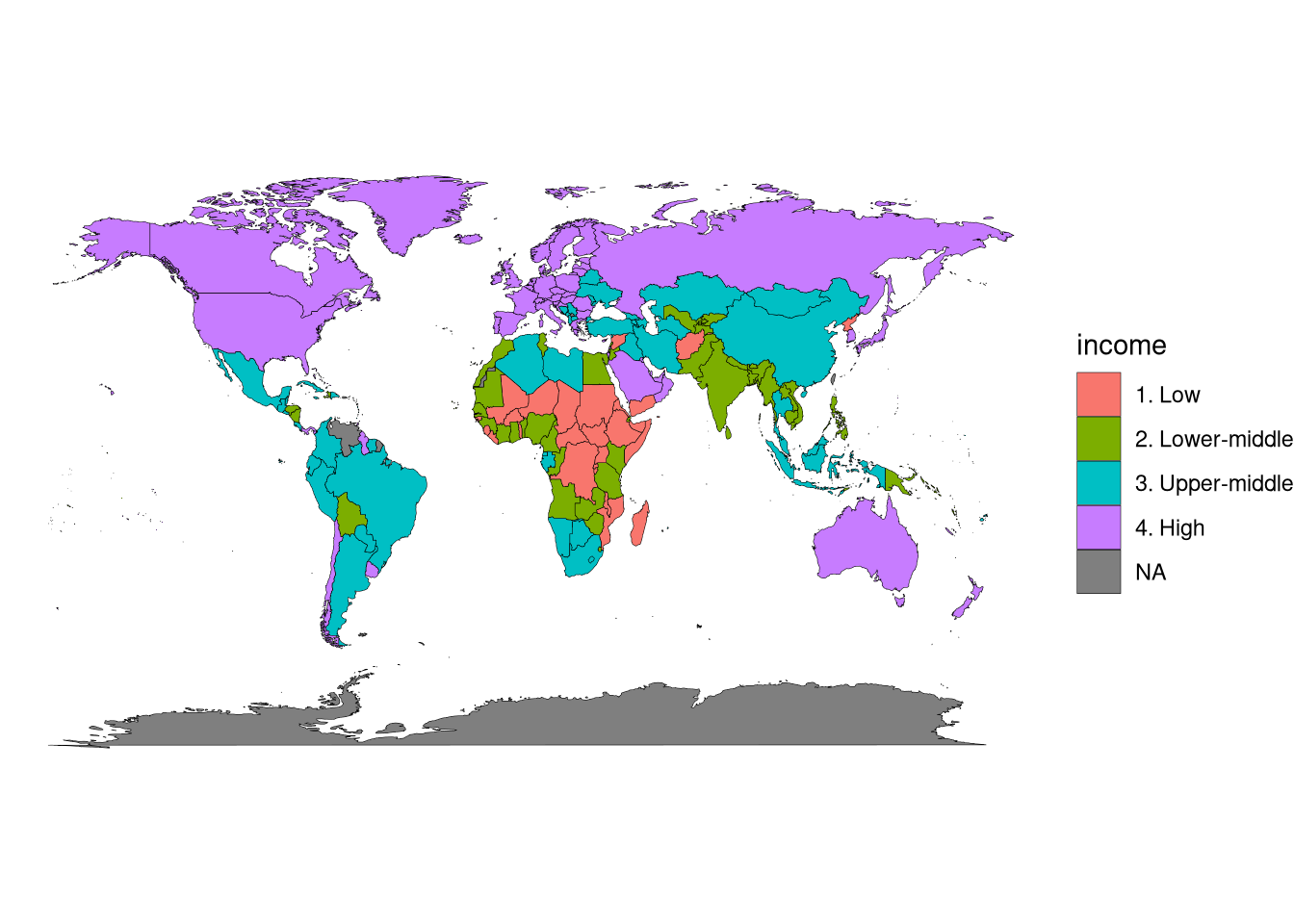
ggplot(aes(x = long, y = lat, group = group)) tells ggplot() to put longitude (long) on the \(x\)-axis, latitude (lat) on the \(y\) axis, and to use the group column to separate out different countries (or non-contiguous pieces of countries).
geom_polygon() instructs ggplot() to draw the map.
aes(fill = income) tells it to color-code each country by income category.color = "black" tells it to draw country borders as black lines.linewidth = 0.1 tells it to draw relatively thin country borders (the default is kind of thick and ugly).coord_fixed(1.3) instructs ggplot() to make the \(x\)-axis 1.3 times the size of the \(y\)-axis, so that the output is proportional to a standard map projection.
theme_void() instructs ggplot() not to draw grid lines, axis labels, or any of the other standard plotting elements that we saw on the earlier figures.
If you don’t like the default choice of colors (and indeed I don’t!), you can use scale_fill_manual() to explicitly set colors for each category, or scale_fill_grey() to do a grayscale spectrum.
df_world_map |>
  ggplot(aes(x = long, y = lat, group = group)) +
  geom_polygon(aes(fill = income), color = "black", linewidth = 0.1) +
  coord_fixed(1.3) +
  theme_void() +
  scale_fill_grey(start = 0.8, end = 0.2, na.value = "white")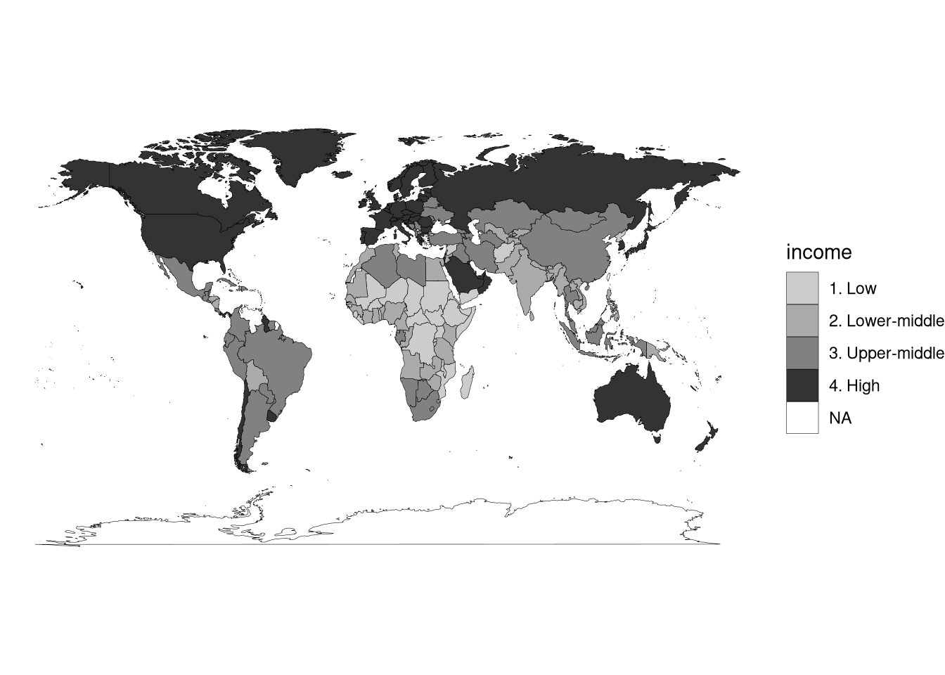
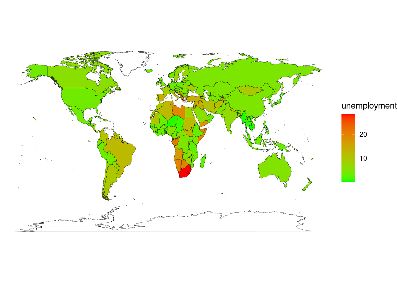
Finally, if you want to color code by a continuous variable, you can use scale_fill_gradient() to create a spectrum of colors going from low to high.
df_world_map |>
  ggplot(aes(x = long, y = lat, group = group)) +
  geom_polygon(aes(fill = unemployment), color = "black", linewidth = 0.1) +
  coord_fixed(1.3) +
  theme_void() +
  scale_fill_gradient(low = "green", high = "red", na.value = "white")